Today we have a Blackest Night double feature! Last week, DC Direct released the second wave of Blackest Night figures hot on the heels of Mattel’s release of the DC Classics Color of Fear two-pack. In this review, we’ll take a look at Kryb and Indigo from DC Direct and then we’ll follow up with a review of Romat Ru and Karu-Sil from Mattel.
Blackest Night is the biggest story in comics right now and we’re only about halfway through the ninety books it runs through. The basic outline is simple: the Green Lantern Corps is now part of a larger mythos with other ringbearers who utilize various emotions that correspond to their particular color of the rainbow. The different colors don’t all get along, but they’re being forced to fight alongside one another against an eighth corps of reanimated dead, the Black Lanterns, that feed on emotion and want to end life as we know it. Creepy, huh? Of course, it’s fantastically more complicated than that and if you’d like to learn more, check out the Blackest Night mini-site at DCComics.com.
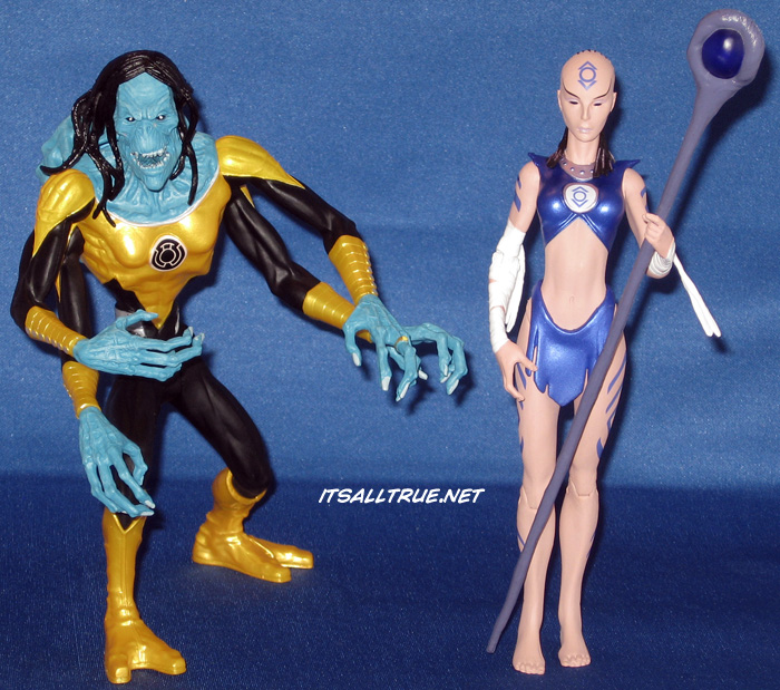
Anyway, the second wave of figures was released on November 25th. It included a new version of Green Lantern John Stewart, Indigo of the Indigo Tribe, Black Lantern Martian Manhunter, and Kryb of the Sinestro Corps. This review covers Kryb and Indigo.
As I said in my review for Saint Walker and Atrocitus last month, DC Classics has cornered my toy budget for DC figures – I’ve only purchased five DC Direct figures (counting Kryb and Indigo) in the last three years. I’m not the biggest fan of mixing toy lines on my shelf, but Mattel’s success with DC Classics is also its biggest weakness: the buck body. I’m not sure when (or if) we’ll be getting DC Classics of the non-human Lantern Corps members, so I’m looking to DC Direct and hoping their penchant for making figures big will help add some diversity to my DC Classics shelf.

Indigo
To be honest, Indigo was a stretch for me. I wasn’t planning on buying her for two reasons. One, because she really hasn’t had a chance to flourish and became a favorite like Walker or Larfleeze (yet). Tnd two, because she’s definitely too tall to fit in with my DC Classics comfortably. I decided to relent on the scale issues a little (as I had for Walker) and I admit that I really want the “Big 7” of the rainbow brigade. Plus, her size (like Walker’s) isn’t consistent throughout. Sometimes they’re both drawn as lanky/tall like Sinestro, and other times they’re shorter than Hal Jordan. (you know, cause he’s so awesome he has to be the tallest).
So I ordered Indigo. And I want to like it, but I have several nitpicks about it. First, let me say the sculptor did a great job on the lankier proportions and the costume detailing, but my praise ends there. The proportions are bad, the head looks off, and there are clear errors with this figure It’s a disappointment.
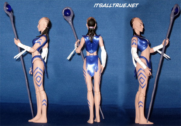
My main problem with the figure is the 120 degree angle in her spine. Unless you’re seeing her from the front, her body is twisted strangely. I don’t understand how the sculptor didn’t notice that he lined up Indigo’s sternum is so far back, it’s even with her tailbone. It’s awful.
To make it worse, we get another ringbearer without a sculpted fist on her ring hand. This should have been a basic requirement DC Direct gave to the sculptors – ring hands get fists. But wait, there’s more to this one! Indigo doesn’t have her ring. Not even a paint drop pretending to be one. To be fair, she didn’t have one in the early artwork either and that’s probably the reason for the omission, but I’m still counting it up as an error since a late paint application could have at least carried it.
Paint is usually DC Direct’s high point and this figure has a lot of good points at first. The metallic paint is nice, but I liked the colors better in the solicit. The costume details are painted well. The tattoos are nice and sharp too, but the tattoo on the head is too small. This is particularly annoying since a look at the solicit picture shows that the sculptor etched in lines for the tattoo at the right size, but those were smoothed out and the too small symbol was stamped on instead. But the one place where the paint really fails is the head sculpt. Indigo looked good in the solicit. I included the comparison up above. The paler skin, the shading on the cheeks and eyes, the dark lips. None of that made it to the final product. She has normal skintone and the lack of shading has turned her into a beady–eyed grey alien that just looks off no matter how you try to go about it. Again, very disappointing.
Articulation is a weak point for DC Direct, but this figure comes out mostly okay. Her head range is excellent and her basic articulation is good for DC Direct. As a staff wielder, she probably should have had cut wrists and a bicep swivel wouldn’t hurt anything on these figures either. Speaking of that staff…
The staff is her lone accessory. It is the equivalent of an Indigo Lantern, but it looks nothing like one. I’ve looked through the various depictions of Indigo Lanterns (back to 2007) and I can’t find anywhere where the staff looked like it does here. If you’re staring at it head-on, it looks like it should (similar to the figure with her broken spine), but turn it to the side and you can see that it’s completely wrong. As a nice touch, DC Direct provided sample images of the figure only from the front. Was this to obscure that it was sculpted incorrectly? If it was – nice cover, DCD. Too bad we figured it out when we saw the figure in person.
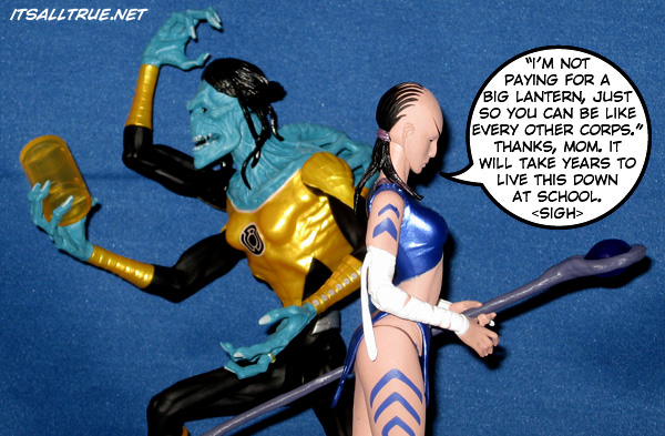
Kryb
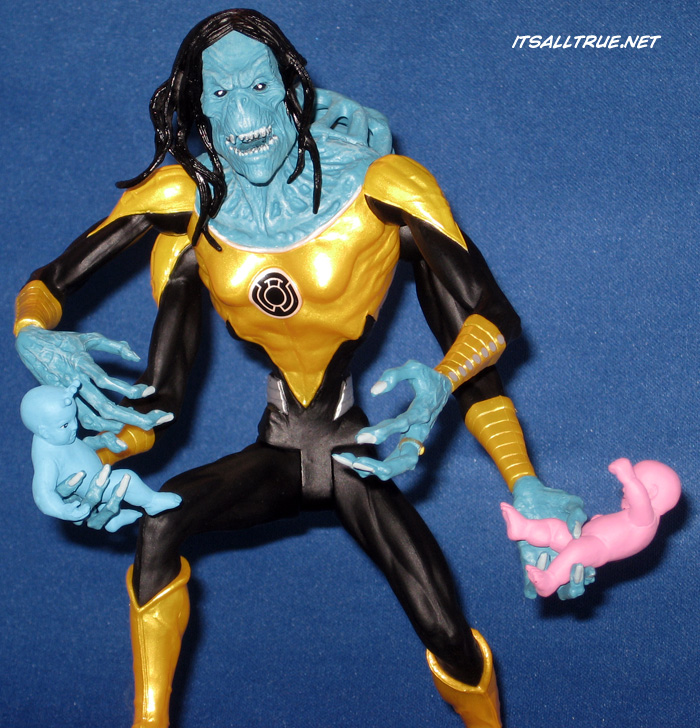
Okay, we did Indigo first because I like Kryb better. The sculptor did a great job of making Kryb disturbing with great detail work. But does it look like Kryb? I’m going to leave that up to you. Like a lot of the new Lanterns her look has been evolving from artist to artist (we’ll call it evolving anyway). For my dollar, this is what I think Kryb looks like, so I am happy with the figure. If you preferred the narrow head and spindly limbs version, you mileage may very.
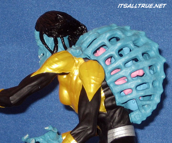
The cage on her back pops off-and-on easily with plenty of room for the two orphans. The detail work on her back sells the cage. It looks great. The only things about the sculpt that I didn’t like was the lack of a fist on the ring hand and that the pose was sculpted with the stand in mind. Kryb can stand without it, but only in a deep crouch. On the shelf, I’m going to have to keep her right foot on a GL stand so that she can stand straighter and look more imposing.
Paint on Kryb is great. The metallic colors that DC Direct is using really makes the Lanterns stand out and all the lines are crisp throughout the figure.
Handicapping DC Direct for articulation, I’m happy here as well. There are some things I would have liked – like knee and ankle joints to get rid of the sculpted crouch – but the ball joints on the arms and the swivel wrists make me happy. An elbow would be nice, but I don’t miss it as much as I thought I would. The range of motion on the head is good and the softer hair piece doesn’t block the joint at all.
I was disappointed that Kryb was missing a yellow lantern, but she does include two orphans as accessories. They’re both nice pieces – well-sculpted and well-painted. As I said above, they fit in the cage snugly and even better, they fit perfectly in Kryb’s lower hands. Great job there.
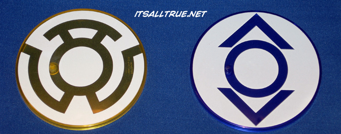
Both figures also include a stand. I find myself looking forward to assembling a set of eight stands for the various Lantern symbols. Sounds silly, I know.
In Conclusion…
My main reason for buying these is to fit them in with DC Classics. Kryb fits seamlessly. Her size may not be dead-on, but she looks good in a group shot (check out our Color of Fear review) with a mix of the figures. Since she fits in well, and turned out to be a solid figure of a character that I’m interested in, I’m very happy with her on the shelf.
Indigo is not so clear cut for me. She looks a little out-of-place in the group shot, but it works I guess. I’m more disappointed in how different she is from the figure I thought I was ordering. The colors are off, the paint applications were reduced, the staff is wrong (which is a problem – are there any more Indigo Tribe members in the pike? Will we ever get a proper Indigo Lantern?), and the figure turned out to be a letdown. I want all seven, so I don’t have buyer’s remorse, but the figure is definitely lacking. If DC Direct decides to revisit Blackest Night figures as a reissue wave of four a couple years from now, Indigo is my first choice to be redone. If they redo the paints, change the staff, and maybe revisit the head sculpt – they’ll easily get another sale from me.
Have thoughts to share? Let us know what you think in the comments below. And don’t forget to check out the second part of our Blackest Night Double Feature: The Color of Fear 2pk Review!
I will admit that DC Direct seems to be doing a better than average job on these, but Mattel makes the DC toys that earn my money. I just have to hope that it lasts long enough to get some of these Blackest Night figures into the mix.
I’d love to get some Blackest Night figures in DC Classics, but I’m buying these to be safe. If they get redone (and are better) I’ll gladly trade up.
Well, not that they’ve said they have plans in Spring 2011 to do Blackest Night, are you still getting the DC Direct versions?
Until I know for sure, yes.
These just aren’t worth $20. I know you’re buying them, but you can’t really support these for the masses. They’re not good enough for that price tag.
That Indigo figure is an excellent example. She’s clearly not worth $20, but when placed next to the solicit, she looks that much more horrible.
To be fair, I got them for $12. :p
Indigo though, I still regret.
Cheaper than DC Classics? Good score.
But still too much for those statues.
LOL.
Indigo was definitely ruined post-solicit, but its not like its the first time.
I love my DCDs anyway and Blackest Night are some of the best figures they’ve ever produced.
I don’t mind peppering in some DCDs, but I value the consistency of the figures from Mattel.
these remind me a lot of the more static but dynamic posed figs that emerged from the late 90’s… and that’s kind of sad. like some of the youngblood, early hellboy and warrior nun areala figs would look great next to your DCD lanterns.
It’s really in the sculptors hands. This wave was handled by 2-3 different sculptors and they have too much control in my opinion. DCD should be more assertive in what it wants.
These sculptors are good, but it wouldn’t hurt to have a businessman in the mix too.
Hate to disagree with the Main Man on his own site (who knows I might get censored anyways), but your comment is so rarely the case. Usually the sculptors go in with grand ideas only to be cut back and restrained by the “suits” and rarely have much control in the end at all. The Horsemen’s amount of control, on the flip side, is very unusual and is the benefit of DCUC Classics not the downside as the comment would infer. One of the few good things about Mattel is letting them design to the maximum of their budget. DC Direct has been cutting back A LOT, and unfortunately when they finally came to a very popular line, they have to budget tighter than even they would probably prefer.
Other than Mr. Rant today, I don’t think we really censor around here. Haven’t had a reason to yet anyway!
I’d completely agree with you on most toy lines, but not on DC Direct. The BL Superman is sculpted in this awkward twisted pose. That’s on the sculptor. All the other BLs are normal and Superman can’t be posed normally. Walker’s sculptor chose not to make his ring hand a fist. Indigo’s sculptor botched the accessory and made her sternum/tailbone align. Atrocitus’ biceps are parallel with his body. Time and again with DC Direct, the problem is DCD not imposing uniformity within a section of their toyline. The wild popularity of Justice and McG figures are because of homogeny.
And, to me, that’s the one thing holding BN back. They’re letting the sculptors make decisions and they shouldn’t. That’s the basis for my decision. They should be ordering all vanilla poses or all action poses. They should be saying the rings hands should be fists. They should be willing to reject bad anatomy when it comes in.
Overall, I think you and I might have a different view about creative people vs business people. You refer to the suits “restraining” and “cutting back” on the “grand ideas” of the creativefolk. In my view, creativity does need to be restrained to an extent. You need a business guy to say “he won’t be able to hold his accessory”, “this one won’t stand up without the base”, or “can a human body really twist that way?”
As far as the budget, sure I have my problems with the lack of articulation and Indigo’s paint ops were definitely cut, but the majority of my dislikes point to the sculptor and not the company.
Fair enough. I see what you mean, and I am definitely biased on this particular issue. To me, it could be as simple as neither party getting enough reference material or the licensors nitpicking the sculpt to death for purely subjective nonconstructive reasons — or it could be a sculptor on a bad day. An inherent problem with DC Direct, though is that they let the factory engineer the articulation instead of making,or allowing, the sculptor to do it. The best action figures have predetermined joints for the sculptor to work from. This minimizes maquette-style stances and ensures consistency. There are indeed a limited amount of sculptors who truly understand the action figure format.
As for my censorship swipe, it was a joke, as I’ve had sites censor my comments before. Some sites need to have everything smelling like roses.
I agree about letting the sculptors place the joints – or just having standard joints.
I do like the site to smell like roses, but I understand. Our first comment moderation was today, so I had mixed feelings.LOL
Blackest Night figures are some of the best DC Direct has done in years. It’s a shame that Indigo hasn’t lived up to the bar they’ve set.
Agreed on both counts.
Does Indigo even have rings? I thought they just had their staff-lanterns?
I don’t have these yet, but from these pics,I would have second guessed buying her, as she is vastly different from the prototype in the promos. Like I said on the Walker/Atrocitus review, it appears they were sculpted with the handful of early designs. Kryb has had the luxury of having the most appearances under her belt. Heck, it wasn’t until recently that I realized Kryb was a ‘she’!
They do have rings, but I think it was a later decision and it may have not been on the control art.
Kryb is great, I love that figure.
Me too.
I was really bugged by Indigo’s lack of ring and tootsie pop staff… especially since every picture of her featured a staff topped in the earthy looking lantern top.. I do like the articulated “bandages” hanging from her wrists. I’m with you that she’s a little too off and needs, at the very least, a 4H version…
I’m very tempted by kryb, but I do prefer her with the long skinny head and her hair covering her eyes… just creepier to me.
I forgot to mention the bandages! I did enjoy that they move. It helps the poses look a little more realistic.
And I knew some folks had to prefer the earlier appearances of Kryb.
Kryb, and Kryb alone (and maybe Atrocitus) are making me want to get one of each.
I’m happy with Kryb and Atrocitus. Out of the four, they’re the best two. The artic could be better, but I’m just mixing them into the DCUCs and I can pose them around the DCDs to make a good looking shelf.
great review, I was really tempted by these but cash is short with me just freelancing now.
Most of the Rainbow Lanterns have looked good but I can live without the Zombie squad.
I feel the same. I like the designs of a few BLs, but it’s the new colors that are drawing me in.
I just got these to figures and the john stewart – gl one is the one that ticks me off, why have a battery if he can’t hold it (he has no hole on either hand to slide the battery handle in (bad form dc direct)
Nice. I didn’t catch that.