
As we mentioned in Ted’s biography, he had two boys, David & Jack. David, the older brother, took his father’s legacy to heart and set out early in life to be Starman one day while Jack had no interest in his father’s superhero career. David would take up his father’s mantle only to be killed in short order by the son of Ted’s nemesis, the Mist. After an attempt on Jack’s own life and in an attempt to protect his father, Jack becomes Starman and avenges his brother’s death by killing his brother’s murderer. After that initial story, Jack agrees to continue being Starman only if his father begins working on new innovations for the future of mankind. The James Robinson Starman title kicks off from there. The series, lasting 80 issues, chronicles Jack’s few years as Starman – protecting Opal City, coming to terms with both his brother’s death and his killing the Mist’s son, and understanding his father. The series ends with Jack retiring and, amazingly, he’s been more or less unused in the DC Universe since.
Jack features a mostly all-new buck despite being a variant. Mattel’s been a little unclear about their policy towards that. Originally, when collectors asked about getting GA/MA versions as variants we were told they didn’t want to waste viable characters on variant slots. Then, just recently, Mattel said it was too logistically difficult to do a variant significantly different from the main figure and they we won’t see this happen. And yet, here we have Jack Knight.
Anyway, Jack gives us a new, plainclothes body for the DC line. Overall, the sculpt is good. I’m going to knock it a bit, but that’s because it feels a little too bulky for Jack. He’s not built like your typical superhero. He’s a shopkeeper who occasionally puts on a jacket & goggles and fights crime. I know the sculpt is good because the figure looks sharp, but I just don’t see Jack as musclebound. The body feels more like Clark Kent on casual Friday than Jack Knight.
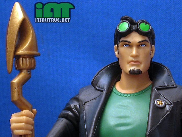
The head sculpt is good too, but, since I’ve gushed about painted heads a few times this week, you can guess that I have mixed feelings about it. It’s still a nice representation of Jack, but there are two things I’d change about it given the chance. One, there is room for interpretation with Jack’s facial hair. I always remember Jack with a mustache and goatee and I wish the figure was sporting that here. The figure isn’t inaccurate, it simply appears a number of different ways throughout the series. Second, I also wish the the goggles had been a separate, removable piece. It would’ve been nice to be able to have them sit up on his head (like they’re sculpted) and be able to slide down and cover his eyes for some action poses.
The new buck features most of the standard articulation, but for some reason, the ab crunch has been removed. I’m always annoyed by articulation removal and particularly so here because I can’t figure out the reason behind it. It’s annoying because Jack’s, like his Dad, would look great on a flight stand, but his articulation makes that problematic. The missing ab crunch is just one aspect. The head doesn’t have as much range as Ted’s, the ankles are more limited than normal because of the pant legs and, as we mentioned with Ted, the lack of ball-wrists prevent the figure from being able to replicate some of the cooler action poses from the comics.
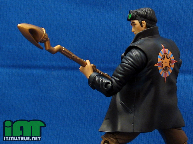
The paint on Jack was fine overall except for some quality control on his face where a thin black line of paint ran down his left cheek. I cleaned it up a bit when it got here, but it’s still somewhat visible in a few of the pictures. The goggles, the badge, and, perhaps most important, the tampo on the back are all sharp and really give the figure a nice look.
When Starman arrived from BBTS, I had to decide if I wanted to replace him or not. It wasn’t because of the paint on this face which cleaned up easily, but because he didn’t have his star rod. Oops. BBTS took care of Mattel’s gaffe and hooked me up with a spare rod. He’s not Starman without it and it’s one of the best parts of the figure. It looks accurate to how I remember it and it’s good-sized, standing as tall as Jack.

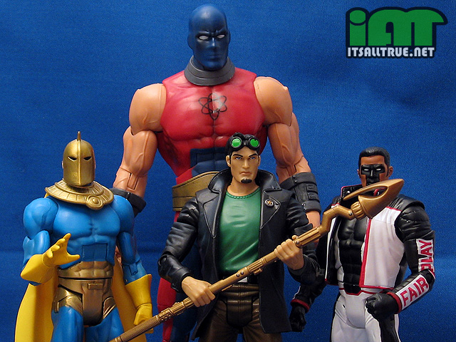
Overall, it felt like a (k)night & day with this pair. I was happy with practically everything on the Golden Age Starman except for the fused hip and Mattel missing the opportunity to do a ball wrist. His costume is vibrant and striking on the shelf and he’s a welcome addition to the still way too small DCUC Golden Age section.
Jack is a different story. I’m glad to have him in the line and, at first glance, he’s an okay figure. But he just feels too bulky and muscular since he’s essentially a ‘civilian’ character. Since he has a unique buck, that’s more of an issue than he if were using another figure’s pieces. Removable goggles and better (or even standard) articulation would’ve probably helped me like the figure more. Still, there are positives – the nice head sculpt, the rod is great (let’s get to a Stargirl figure, Mattel) and it’s cool to finally have an alternative to the permanently crouched DC Direct Jack Knight.

For more DCUC reviews, check out our DC Classics Collector’s Guide.
Love that last shot of that horrible hole in Mr. Terrific’s jacket.
The problem with that body makes me cringe in worry over what I will finally get if they ever do produce an Ambush Bug. I’ll happily buy the figure no matter what, but there’s no way they will do an entire resculpt and his body probably wouldn’t work as a buck for anything else. So, I guess I’ll just get a musclebound on and be happy…
The hole does serve a purpose, but yeah.
And yeah, Ambush Bug is not likely to get a unique baggy sculpt.
I liked the Jack figure, but I really didn’t think about his size until I saw your height chart. It really shows that he’s more built than he should be.
Just a bit. He’s a normal dude doing superhero things. I like the figure, but I would’ve liked him more if he were smaller.
knowing you this, i’m still amazed by some of your observations noisy… i can’t help but look as jakc as a vast improvement over ted, who looks like a 5 dollar toy from the discount bin. the large swathes of unpainted plastic not only make him look like a toothbrush, but they showcase his mold flashing right up front. the painting of the face is nice, but it’s one rightthing on top of a litany of crap.
jack show next to no mold flashing, his articulation is hidden better, and he looks like a human being who happens to be a superhero, rather than like an icon of 50’s TV who commits suicide in the restroom of a red roof inn.
i do think the green arrow wrist would have been a right step on both guys too.
i would like to make an extra special shoutout here to BTBS for being twice the company that mattel is. kudos BBTS for doing your customers right… and that’s why i buy from them too.
I think Noisy has it right on. The golden age Starman looks great in the slowly assembling Justice Society and fits in with the overall line. Jack’s toy isn’t bad, but it looks like the character on venom. It reminds of that MOS Clark Kent that came with the car. That looked silly, but it was Superman at least. This is Jack, he’s not buff.
What paint ops would you have wanted on Starman? He’s a GAer – there shouldn’t be any drybrushing, any paintwashes, or anything that complicates his looks. Simple red and green, bright and optimistic like their time period is portrayed.
You’re both wrong on Ted Knight. He does have the same light airbrushing on the muscles that MOST of the line has. The Spectre, Dr. Fate, Starman, etc all have the light black sprayed on to bring out definition. So they do have the extra paint work AND they do look good because of it. I imagine neither of you has these in hand yet.
I was really happy with the Ted figure after I unfroze his hip. I wish wave fourteen would show up so we can get Alan and Rex. And where the hell is Jay Garrick?
There is some airbrushing on him, yep, but it’s hard to say in the pics.
i’m less perturbed by the paint than in how the flat molded color makes the mold flashing really pop. and the light airbrushing doesn’t make this ok. remember when hasbro caught no end of crap for dropping the paint aps on marvel legends and relying instead on molded garish colors? they were right to be criticized, as mattel is right to be criticized on that front too.
the ONLY viable excuse, as halifax pointed out, is the nostalgic look of the GA heroes, which they mimics… ‘cept, you weren’t dropping 15 bucks a pop on comics in the golden age. those heroes are being raped by the actions of mattel and the lunacy of the fanbase. those heroes represented values that modern fans completely ignore. it’s a shallow argument to suggest that shoddy product and usurious pricing harken back to the “innocent” age that urged young people to stand up for truth and justice (while minimizing the significance of minorities and women, and perpetuating racial stereotypes and paranoia, but i’m not here to debate GA comic philosophy.)
look, i know it’s toys. i get it. who wants to get critical of the character they love/toy they’ve longed for/creation house they adore, right? well, i do. as a fan of the hobby, isn’t there a point when objectivity must be applied to irrational business practices and ravenous fan loyalty and ask WHY? have they really earned this fanatical and unquestioning fanbase? cuz i flat out don’t see it.
and for the record, i love the golden age of comics (though they are far from perfect.) i’d love to see proper toys offered, at conscionable prices, that payed proper tribute to this wonderful era w/ great characters… but dcu ain’t it. there’s problems in muddville, and i refuse to put my head back in the sand. ted is but one example of a larger and more disturbing trend, and it’s that, more than this one figure, that offends me.
You have to remember that you come at Mattel/DCUC from the “the shoddiest ML fig looks like par for the course for DCU” angle. And, as I travel around the forums I post on, I don’t find that to be a popular and/or common opinion.
It’s certainly valid as opinions go, but it’s also one that I don’t agree with. I pointed out my subjective problems with these figures. They’re not the same as yours. And I imagine that the disconnect you’re seeing here in the comments section might simply be that this “larger disturbing trend” is similarly something where people don’t prioritize the same as you. That said, I’m not sure if you should be framing this issue as you keeping your head out of the sand while the rest of us are part of a fanatical and unquestioning fanbase.
Well said.
Great review, as always. One side note–I find it funny how folks differ on opinions. I have always preferred flesh-molded faces to painted faces because the color-tone never looks right to me. To each his or her own!
In any case, my guess on Jack’s “buff” body is that it was intentionally designed that way–because it wasn’t designed for Jack at all! My guess is that this body was actually sculpted for a yet-to-be-announced Conner Kent Superboy figure. Just a change of arms and new head and *presto* a great Conner Kent. Hopefully that star-staff will be released with a Stargirl sometime soon!
Thanks, BD!
I should’ve mentioned the “prepaint” possibilities with Jack in the review. I’m sure we’ll see some of these pieces again where they fit better than they fit with Jack.
You’ve never been to a Brazilian JiuJitsu gym before, have you? As I recall Jack was a BJJ’er among many other things and not just a shop keeper. It would stand to reason that Jack would have a thicker torso that many wrestlers, judoka, and bjj’ers normally carry.
It might stand to reason, but I just don’t remember him being portrayed as bulky or muscular. Both Harris and Snejbjerg usually drew him as a normal guy.
Yeah, they stressed on several occasions Jack’s training and pointed out that he kept in good shape, but he wasn’t quite this big. Not a deal-breaker, though. I can’t wait to get the figure, either way.
It really is interesting how opinions differ when it comes to aesthetics. One of my biggest complaints with Hourman is the yellow paint over the black molded plastic on his legs. That just screams “BAD CUSTOM” to me even though the coverage is fairly good. I would have been MUCH happier if the legs had been molded in the same yellow plastic as his head with same orange-yellow drybrush/wash to bring out the details.
I do notice the mold flashings on the figures that have large unpainted areas, but they don’t bother me. Ted is actually one of my fsvorite DCUC figured to date and I’ve been a fan of the character since I started reading comics in 1974.
I haven’t paid close attention to Hourman yet, but that doesn’t sound like a bad combo. I’m still not sure what I want to do about his hood. I think I’d prefer the black on it.
Mold lines are usually a non-issue to me unless they’re in an obviously bad place. The shoulders though, don’t bother me much. On Jack, they run the length of his arms and that doesn’t really bother me either.
I started reading comics in the early 80s, but it was mostly reprints – lots of great JSA stories in ’em.
Yeah, it is weird how people have different preferences.
I usually actually prefer molded flesh tone with some paint highlights as opposed to needing thick goopy flesh tone paint over red or black or whatever plastic.
But both have great examples, it just depends on specific execution.
I’m never for goopy paint! LOL
You are right though, there are some great molded heads out there.
As for the figures themselves, I just don’t have much knowledge/love of the characters.
I tried to start reading the Robinson Starman stuff, but it just didn’t grab me.
That was a few years ago though, maybe I oughtta give it another go. 🙂
I really enjoyed at the time, but Robinson now is starting to sour me on Robinson then. 😀
The new hardcovers are collecting in the proper order with the in-between issues where they belong. I’m not sure how many volumes along they are right now.
Vol. 5 just came out last month, and vol. 6 is coming in January, completing the set. Far and away the best superhero comics of the ’90s, no doubt about it. I still pull out the entire run every year and re-read it.
I’ve come to the conclusion that the current “James Robinson” isn’t James Robinson at all. Chuck Austen murdered him, and is wearing his skin and writing lousy comics once again.
Feeling lukewarm about Jack after your review. In addition to the flaws you pointed out, both the astrological symbol on his back (black and orange inverted, blue should be green) and the sheriff’s badge (all silver) are miscolored. That stuff’s on the cover to the first issue of his series, Starman #0.
By the way, slightly disappointed that they didn’t go with a more trenchcoat-esque sculpt; Jack’s coat should have a belt-type thingy on the back similar to the one DCU Question has. And buttons. He’s also missing his earrings; too many paint apps?
All in all, he feels like an afterthought, a rebel brought to heel by budget constraints masquerading as a charming uniformity. Gentleman Ghost debuted with a “unique” sculpt, too. I’m sure Jack will get as much reuse/preuse as possible, which at least makes his bulk understandable.
If I ever see him (only one in 15 I haven’t found once), I might get him. Because he’s a great character and an OK figure and we’ll likely never see a better mass market representation. But he could’ve been great. Source-accurate like Blue Beetle III, and like BB and Captain Cold, getting away with human proportions by not wearing spandex.
I haven’t seen any 15 at retail, is he harder to find then the rest? That’s kinda sucky, if so.
I didn’t even think to look about the colors of the back (and front) of the jacket. Good catch! I do think there is some pre-use going on here, which I should’ve mentioned in my review.
STARMAN is one of my favorite series ever, so Jack will be mine.
Also, it is a little late, but congrats on the wedding!
Thanks, Aaron!
No matter what specific issues I have with the figure, it is cool to get Jack in the line!
Cool review, this is a great looking wave.
I thought I ordered Ted from Amazon the other week, but got JACK instead, who I actually preferred. I do agree that the body could (WILL?) be re-used, but for “casual/Smallville” Clark, but not a modern Conner, who is still too small as a “teen” to be that bulky, but I suppose the recent artists are drawing him almost 20-something, lately, aren’t they? Jack’s torso is even too bulky for a Jimmy Olsen figure, imho, which is the one I was hoping to custom him for.
Actually, I wouldn’t mind if we got a couple “civilian” variants once in a while! this/Mr.T body for Clark/Hal/Kyle, “suit” for Bruce/Barry/J’onn, altho we’d probably get the Katma/blank F buck for Diana as the toga/dress wouldn’t work for many other women, would it? maybe the Raven body with skirt replacing the tabard for Diana and Lois??
I’ll hold off on any comments toward Ted for now, but I do hope they re-release that Kent-Fate. I saw him once, but didn’t have the extra to drop on him or Adam, and now both are getting up to the $40-50 and higher bracket. (This was the same day I saw TWO G.Ghosts. STILL kicking myself for passing on them!) at least I was able to catch Adam at a later date with Hector….
Does anyone have any ideas about how to keep the Cosmic Rod in Starman’s hand…so it doesn’t fall out!??? Or did I miss it??!!
I think he looks great.!! It’s just that I’m going to lose the Rod if it can’t be more firmly fixed in his hand. Tape can make the whole thing nasty.
Geeeesh!! Still no answer!! Hello!!?? Anyone there??
My Cosmic Rod still falls out of his hand months later.
Any ideas??