
 I finally found some Comic Series II! In the last few weeks, I’ve been mocked by more Classic and light-up armors than you would believe. I’ve been tortured by unusable $5 off stickers. I’ve looked through pegs and pegs of IM2 toys and not found much new… and it’s been kinda fun!When you’re spending most of your money on MOTU and DC Classics, you don’t get the opportunity to thumb through many pegs for stuff to buy. I may not have them all yet, but I’m two closer.
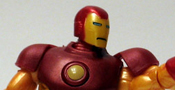
Comics Series # 28 – Mark II – Proto-Armor
I got a little déjà vu buying this figure. See, I’ve already reviewed it from the neck down. Now, repaints aren’t uncommon in an Iron Man line. I just reviewed the Fusion Armor which was really just a blue Mark III. I don’t mind the body reuse, if the armor has a cool design or a new paint, I’m all for it. But in this case, I’m left a little cold. The buck, sculpted for the Mark V could have been used on the muscular Mark IV armor, but the Mark II and Mark III armors were still relatively smooth and shell-like rather than anatomically ideal. The reuse also gives this figure repulsors and hip pods, which weren’t added until later armors. In all, it’s pretty far off the mark. It feels like Tony grabbed the wrong helmet on his way out of the armory.

Did I bore you with that? I know it’s a little dry, but I’m mainly buying the line to pick up the various armors and with so many Iron Men, details are going to be important. I still like the body sculpt – it’s a vast improvement over the MU version, but it’s just wrong here. The head sculpt, though, is great. The horns are present and the faceplate looks more menacing to help distinguish him from similar armors. One interesting note about the head is that it’s larger than the Mark V head. I’m not sure which is better proportioned, but it makes them look a little odd when placed next to one another.

Paint is still a problem for the line, but it’s harder to deal with now since the newer waves aren’t overflowing on the pegs. I got to choose from three proto armors and I wouldn’t have bought the other two. The one I have has a few chinks and scratches in the red metallic paint, but nothing terribly objectionable. The paint has another issue here though: the flip-up hinges on the faceplate have gone without the yellow paint they need to be accurate. Since later armors featured the raised ear covers, you could say the figure is sporting those instead of unpainted hinges, but that would be just more armor inaccuracy.
The Mark II has standard articulation for the line: balls at the ankles, hips, elbows, shoulders, torso, and head, double-hinged knees, and cuts at the wrists and like most figures the ball-jointed head is restricted though and relegated to being a swivel cut.

To continue this figures Mark V with a new head theme, he also includes the same repulsor blast and blast off base in addition to this standard gray base and three armor cards that all figures include. I guess if he’s going to have repulsors, he may as well have the blast too. Continue to Oversize Armor…
That’s a lot of Iron Men figures. Is the line really that hero heavy or are you just not buying that many villains?
It’s really Iron Man heavy! There is a movie Iron Monger, and comic versions of the Titanium Man and the Guardsman (though he could be the hero version, not sure), and Whiplash is out, but rare apparently.
The proto head looks better IMO. The classic head is tiny.
I think the right is somewhere in between. LOL
I’ve always called that Neo-Classic. I’ve never heard of Oversize Armor before.
I hear that a lot. 😀 But I got on the oversize train and I’m stuck on it now.
I hate finding the $5 stickers on series one figs!
That said, series 2 is a tad boring. The proto figure is cheap, HB small, Guardian is a bad MU, etc.
I can see your point, but it’s just fun line to collect.
The background pic for the Proto-Armor makes it look like he’s trying to scare himself.
I’ve constantly been comparing these and some Marvel Universe figures to the old Toy Biz Showdown stuff, and for the “Oversize” armor, I prefer the proportions of the Showdown version, even if it’s a bit “undersized”. Also, those hinged shoulders still bother me a bit.
http://marvelousnews.com/database/index.php?itemid=1006
LOL. You should have seen the first pic I tried.
I remember seeing the SS one, but I never bought SS back then. I was trying to avoid this scale. I still kinda am, but when you have a website to review stuff, your purchasing rules get a bit looser. 😛
I was hoping for a couple more pictures, but otherwise good review.
I always called the armor neoclassics too. I think the armory guy might be the one guy who doesn’t.
Sometimes inspiration strikes, sometime you have to fight for it, and sometimes you just get six pictures.
I’m with Armory guy. Is there a Team Rassbach?
Thanks for this review. I haven’t been able to find comic series 2 anywhere!
I’m hearing that it’s showing up more in Kmarts and Targets now, but I need it to show up at TRU again, or Walmart would be nice…
That red wash looks awful. They should have stuck with the same color scheme as the other two figures.
They used a darker yellow to start with and I think that might ahve looked nice. But in the spots where the wash is understated, it’s not bed. It’s the deep wells that suck.
The red wash on the coffee can armor is just ugly. They should have let him be bright and gleaming like the other figures.
I like it in the subtle areas, but it gets too heavy in places.
But, I agree, the brighter yellow would’ve been cool!