
But here’s the best thing about MOTU, if you can just let yourself do it. You can forget all that. You can call these guys whatever you want. You can switch their allegiances. You can do whatever. It’s okay. The only things I don’t like about these figures are in that bio. And, guess what? That was printed on a box I threw in the trash! I’m free!!
And what I’m free to do is really enjoy these three figures for what they are. Three great “new” additions to the universe (I have to put new in quotes because these three actually pre-date a lot of the vintage figures). Out of three, Dawg-o-Tor (green guy w/ the yellow visor) is probably my favorite and I’ve decided he leads this little faction. In fact, I guess I’ve kinda patterned how I see this trio after Thundarr the Barbarian. Dawg-O-Tor leads the group as Thundarr, Sherrilyn makes a great Ariel (a kickass female lead that holds her own), and Ditztroyer and his blue skin kinda make him Ookla the Mok. It sounds mean, but everyone wants to make him evil it seems, so he’s better off with me! I don’t know what the three of them go around doing – other than singing. They just seem like they’d be pretty merry as they go around doing their business if you ask me.

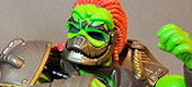
In terms of sculpt, all three of these figures make extensive re-use of previous molds. There’s very little new here (see, I said there were valid reasons to dislike ‘em) and that does the characters a bit of an injustice. Each figure basically sports a new head and a chest armor or a cape, and then the interchangeable chest plates. Luckily, those few pieces along with some parts culled from other figures do still get the job done and make the figures look unique. My favorite part of the sculpt is the clear visor on Dawg (something I wish they would’ve replicated for Sherrilyn, though I do love her hyper-anime helmet.
With all the reuse, articulation is exactly what you expect. Dawg & Ditz feature the same articulation as every other basic male figure, while Sherrilyn has the limitations of the Battleground Teela body – it looks good aesthetically, but the lack of an ab crunch & thigh swivels do hinder poseability.

The paint work on my set was pretty good overall. I do get worried whenever Mattel wants to package multiple figures together, that’s some scary QC luck right there. I did have some issues, most notably was around Sherrilyn’s mask & nose. That’s a tough area to paint since the head is one piece. There was also an errant silver swipe of paint on Dawg’s back. The extra silver doesn’t bother me, but I would like to do a little repainting on Sherrilyn.
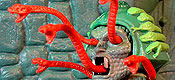
Finally, we get to where all the tooling went for this set: the accessories. I already mentioned the interchangeable chest plates. Each of the three has a unique chestplate that matches up with their vehicle and then also comes with a Horde Symbol for when they’re thawed out years later. The Horde thing is neat, but I’m okay. I had more fun switching the armors around, notably giving Ditz the Talon armor and Dawg the Roton armor. Some of the later pics in the gallery will feature that arrangement, so I could share. (I wonder if anyone will only look at the pics and comment that I’ve “mistakenly” switched them up? You know it’s gonna happen!!)

The real tooling went to the two weapons that came with each figure. Some of the gear is cooler than other pieces – some looks like it was swiped directly off the vehicle they were piloting. Ditz includes one of the front-mounted cannons (neat) and a staff that’s head fits in with the Roton theme (really neat). Dawg has a Talon-inspired shield and then one of the blasters (which seems more like a club for the figure). Finally, Sherrilyn includes a shield & dual-barreled blaster also lifted from the Attack Trak. I like the weapons to varying degrees with Ditz’s staff at the high end and Sherri’s shield at the low end. The pieces are all night and the six accessories and three extra chest plates did help with the $75 sting a little bit.

Alright, I know I started this review off a little preachy, but I get a little downtrodden when I pop onto a forum and read someone bashing this set. I know there are reasons to do so, but I found the ser pretty enjoyable overall. I love the overall look of the three figures. I love the bright colors. I think these three are some of the best additions to the mythos yet and I hope more & more collectors can overlook any bias towards them and discover that too.
The other good thing for me about getting “newer” characters is that I can slot them in to the mythos more easily. Like I said above, I’m not a fan of their bio. Now, even I would have a hard-time going out there and trying to use Mer-Man like a hero, but that’s just not true for these new guys. They can be blank slates. That’s exactly how I treated them for this review and I had so much fun with them, I ended up with 20+ pics and a little strip for everyone to enjoy. If I took 20 pics, I must have had a good time!


For more MOTU reviews, check out our
MOTU Classics Collector’s Guide.
 |
  |
|
 |
 |
 |
For all our MOTU reviews, check out our
MOTU Classics Collector’s Guide.
Great pics and amusing story as always. Ditztroyer looks just like NoMan from Wally Wood’s T.H.U.N.D.E.R. Agents.
I’ve long ignored those wacky bios or whatever continuity Scott Neitlich has carved out for himself while lording over this brand. As a kid, I loved the LJN Advanced Dungeons & Dragons figures even though I’ve never been remotely interested in fantasy role-playing games. So I ignored the descriptions on the figure cards and made up my own backstories for the various characters.
It ought to be the same deal with all of these new MOTU guys that I don’t know zilch about, but I’m not a kid anymore and frankly, burned out on this line. I’m still pondering whether or not to pay eBay prices for Two-Bad instead of signing up again. In any case, I’m heavily inclined towards not renewing this year.
That said, I’m glad that these three are out there for those who enjoy them. They’re not my cup of tea and I wish I hadn’t been stuck with them, but such are the risks of subbing.
I’m a little burned out on MOTU too, though for me it’s been due to more & more about the loss of concept/modern figures and the vintage figures coming out with less & less detail. “Classicizing” has become a lot of flat, smooth surfaces. Still figs like Clamp Champ & Sky High give me hope. And that Two-Bad loos great! If only Clawful could’ve received such a menacing head sculpt!
I’ll be subbing again for 2014, both MOTUC & DCUC. Mostly, I just like stuff coming to my house with (almost) no hassle, but I also want to see the stuff I might not like so I at least know what is cool about it.
I’m glad someone else noticed the THUNDER Agents similarity! 😉
Great review and pics, and hilarious comics! Thank you for getting my morning off to a good start!
I am also mystified by those who hate these guys so much, yet clamour for Goat Man, who I also never heard of less than a year ago. Personally, I like this set a lot, but wish they’d done the shields better, with holdable handles instead of horrendously tight, paint-scraping clips.
And if anyone gives you grief about raping their childhoods by even acknowledging the Fighting Foe Men’s existence on your page, just send this link back to them:
LOL
I think they’re definitely a great set and, yeah, I just wish some folks would let themselves have a little more fun. I like checklists too, but where is joy on staring at one thinking furiously about what you don’t have?
I like the look of this set a lot, and had it been in any other line than MOTUC I wouldn’t have minded picking it up. But MOTUC in 2013 for an international fan is a game of numbers, with the vastly increased shipping and bumped-up figure prices (which in turn will have you pay more customs for the figures) so any multipack has soared beyond my range…
I long for the “good” old days when I could casually order the Palace Guards or Gygor knowing it would end up being relatively affordable.
Still, great review and great pics!
Thanks, Sandman!
I don’t know how international fans keep up. I don’t think I’d stick with it considering some of the exorbitant costs you guys have to deal with!
This is one set that is neat but if I miss it wouldn’t bug me. I have no memory of the models, don’t think I ever ventured to that area as a kid. I dig the weapons though.
I had no idea about the models either, but they were the kind of obscure oddities I love about old toy lines! And now that we’re getting Sky High too, I’m a lot happier even with the line being reworked to cut a few potentially great figures just to get nostalgic ones out quicker.
I hate to be pithy, but…I just think they are ugly. And not in a “good” way.
Also, concur that naming them after the Horsemen’s assistants was kinda silly – though I am sure they are lovely people (obviously dedicated to the job when that one doesn’t even have time to wash or comb his hair). Anyway, there are literally dozens of people who were integral to this line ever even existing, but none of them has been commemorated in toy form. Who is? Nietlich has gotten two nods in the line, the Horsemen’s gofers or whatever get the Foe Men, and…Stan Lee, for some reason? So…yeah. One man’s priorities are another man’s…well.
They’re not gophers, but are a rather integral part of getting the massive amount of work done at 4H Studios out on time.
Yeah, the line does have a chunk of homages to the modern team to be sure. I often wonder if the vintage team didn’t add a few things in here or there and we just don’t know it.
And nothing wrong with ’em being ugly, though the line is rather garish when you get them all together! lol
is that supposed to read “integral?” 😉 dayraven to the rescue.
Thanks! Stupid autocorrect.
i will say this, on the topic of accepting the foe men… they pass the vintage test. they are as “in the line” as eldor, vikor, he-ro, or dare. in that respect, they deserved being included.
could the actual toys have been executed better? yes. i had problems w/ sherrilyn’s gun pod (and it’s not a particularly great design anyway), problems w/ ditz’ gun grips, and problems w/ o-tor’s mace grip. most of these grips are not designed to fit easily or snugly into the existing motuc grip. that’s a huge problem, since the line is a buck line and there are essentially only 3 hand styles to accommodate. so do it right! it’s not like this set debuted kung fu grip or anything, if accessories don’t fit at this stage of the game, that’s beyond lazy.
also, the designs… man, the colors are loud, and they clash, in a way blatant and almost confrontational. these look super “cartoony” and not in the vein of the earlier designs from the toy line that kept the aesthetic and motifs more sword and sorcery fantasy… HOWEVER, the defense here is the damned filmation cartoon. these designs are very much par for the course for the filmation era, and the loud clashing colors are just white noise in that world. given the huge contingent of filmation fans, those folks should have been pleased as punch at the aesthetic of these figs. largely, that does not seem to be the case, which is why older fans like myself find those voices capricious and childish. either you accept the fun, or you don’t. you can’t argue on behalf of fang man or plundor but then lobby that the foe men look bogus, you simply can’t.
It don’t mind the colours on them, for the most part. They all fit in with the MOTU techno-barbarian vibe. The only one I would change is Ditztroyer and give him a black and red colour scheme, much like the Roton itself. But as they were meant to harken back to those nameless drivers from the Revell model kits, I think do that pretty well.
Technical point of order: That’s Monogram, not Revell. Monogram used to be part of Mattel way back when, bought up sometimes in the early ’70s if memory serves, then cast aside and bought up by main rival Revell sometime in the later ’80s or early ’90s.
It was always fun knowing that some of the key Hot Wheels cars would end up as Monogram model kits.
Easy mistake to make. Not nearly as complicated as the history of other American plastic kit makers like MPC, AMT, Lindberg, Hawk, Aurora, Renwal… 🙂
Now, saying that, it may well be that Revell released the He-Man kits in Europe or the U.K. That sort of thing happened all the time too.
“they pass the vintage test. they are as “in the line” as eldor, vikor, he-ro, or dare. in that respect, they deserved being included.”
This to the Nth degree.
When they were first revealed, I was still a little too invested in only getting the vintage toys made into Classics. Now that my horizons have expanded, the FFM became my most highly anticipated release of the year. That model kit box art is just beautiful, and it captures the strangeness and mystery of the vintage line. I love them.
Now, I do wish they’d saved the FFM name for the actual FFM and given these guys a different, more accurate, collective name. Pilots for Hire or something. I think if they’d been straight-up marketed as pilots with the box art referenced (maybe there are legalities at play, I don’t know) it would have helped ease them into the collectors’ consciousnesses. Only after I figured out they were from vintage MOTU art did I open up to them. Others might have done the same and saved the bad taste in their mouths.
Also, I wish the female was the male. He’s clearly a male on the box art. And if he still needed to be a she, I wish they’d used the POP arms. The arm bands are too distracting and they make her a new “character” in the lore instead of a historical toy (major criteria in my collection). So she ended up on the trade list. But I adore the other two.
For me its not the colors. I’m down with “loud”. The overall designs are somehow…overcrowded? Let me rephrase: The sculpting looks very busy to me. Busy in a way that is actually beyond “hyper anime detail”. Now, if the colors were a little more subdued, maybe that wouldn’t bother me, but the combo of Filmation bright colors and super detailing is kinda vertigo-inducing.
That said, could I see them as a wannabe-Masters comedy relief, as above. Very cute. Still not room on the shelf for Z-listers, though.
I actually picked up a Club Eternia sub for these characters when it reopened late March/early April. I do agree that they don’t look much like villains (though Ditz’s Roton symbol doesn’t exactly make him look friendly,) which makes calling them “Fighting Foe Men” a but odd. Oh. well, it is just to use the historical name for the MOTU bad guys and incorporate it into the toy storyline. They sit with their Horde symbols on with Skeletor and Hordak, though Sherrilynn might migrate to the Heroes side.
I dunno, Noisy. You came into this review with the most optimism I’ve ever seen to have fun with these guys and the review clearly points out a lot of negatives. Scott’s in full subpocalypse mode and I’ve seen him at least use the term Fighting Foe Men as shorthand for being saddled with figures you don’t want in the sub. I think this was just a miscalculation on the buyers interest in these figures and it was still going on right before the “road map” changed. On the Org’s latest Roast Gooble podcast, the crew question Scott N. and Eric T. about the Plundor decision. They cite fan demand to which no one on the panel can confirm for themselves. If no one on the #1 He-Man podcast can get jazzed about a reveal, there’s a miscommunication between the brand manager and the fans.
We’re all in it for fun. Back in the day there were entire waves of figures that were all concept and I’d pick out which ones were cool. But cool is a subjective term and I wasn’t forced to buy all of them. Let’s use a closer example: the 30th anniversary sub. I had 0 interest in that, didn’t sub, and then I saw reviews of Castle Grayskull man and thought, ‘Wow. Now that’s pretty sweet”. I ended up buying him during a December sale separately. That’s the way it should work! Instead, the process of “cherry picking” is frowned upon by Mattel et. al and you’re a bad fan for doing so. But we’re told there’s no other choice. Niche market, logistics, plastic costs, billion dollar corporation are the terms thrown back at us. You know what would solve it all?
A new cartoon.
Hire professional writers with a passion for the brand and a kick ass animation studio (maybe the one behind Young Justice) and suddenly it’s a lot easier to make He-Man products.
I dunno, I’ve really gotten the impression over the years that Scott aka ToyGuru got his B.A. in BS. He can just shovel it high and seems most just lap it up.
Truth doesn’t matter, keeping his job does. And you know, on one level I can’t blame him for that.
Now, new cartoon. It could happen, but I just don’t see it. There is no longer any afternoon kidvid on local TV for it to syndicate to. Cartoon Network is more and more focused on in-house generated product. Nick only wants cartoons that are like Spongebob. SyFy doesn’t run animation anymore and being part of Comcast/NBC/Universal, again, it’s not in-house generated. Forget Disney Channel.
So who is there to run a cartoon even if Mattel ponied up the cash for production upfront (which you KNOW they would not do)?
Movie? Fine. then the toyline is movie specific and forget MOTUC. And the few retailers that still SELL toys may well be gunshy about another Mattel ‘big movie toy push’ given the flops of Green Lantern and Man of Steel*.
I don’t mean to sound all Debby Downer but we need to face the reality that the only way MOTUC could succeed now is if Mattel had faith in finding ways to sell and expand the customer base. New paradigms and modes. Thinking long term and not monthly.
And brothers and sisters, Mattel ain’t about ANY of that.
*’flop’ as far as toy sales go, MoS seems to be doing average in the U.S.
i think mattel missed a HUGE opportunity when that game was released… they didn’t co-market at all, and it would have been so easy to include a game-purchased coupon for some percent off a figure, or vice versa… or both even. or create a new character in the game and do a figure of that character. or really just about anything, buy the game and get a link to nutlick’s youtube channel to watch him slow eat a slice of meatloaf, ANYTHING. and instead they did nothing to promote the game, or the toys. that kid benedict that won the create-a-character contest has done more to market his one figure than mattel has the entire line.
It’ might be too around the corner, but forget TV. Hulu, Amazon & Netflix have all dipped their toes in original programming. There’s iTunes as well. There’s also a lot more cable channels out there thinking outside the box. Or a CGI movie might do the trick
These guys are totally the Team Rocket of MOTU.
The weapons don’t do much for me and we’ll probably wind up on my spare weapons rack (man I’m glad I invested in two of those).
The blue chap really doesn’t do much for me although he does look better with the green fellows chest plate.
But the green guy and the girl I’m fairly smitten with. They totally strike me as a pair of mercenary partners and their designs look great together.
I may try posing the blue guy with Cy-Chop in the hopes that their Horde symbols and similar color schemes tie them in together visually.
I think they look kinda neat and wish I had gotten a set.
Main thing that annoys me are her lack of non-helmeted head (giggity?) and Ditz’s flesh torso and blue arms. I had the impression he was a Gar like Keldor/Skeletor, but I guess not? Or is that supposed to be a tan/orange muscle shirt he’s wearing? except: NIPPLES!
as for my take on their identities? my collection shies away from the tech side (which is part of reason I don’t like her helmet), so Dawg is like MAA’s apprentice or Sergeant of the Royal Guards; Ditz is like the traitor Gar, feeding the heroes secret info on the sly; Sherrilyn is captain of the female guard? (hey, so many women wearing almost the same outfit = female guard to me!)
Maybe I’ll track this set down when I get everything settled, legal-wise. Right now, it ain’t happening.
I like the idea of these figures. Box art characters finally come to life. Only thing that’s missing is are there VEHICLES!
wasn’t the Sky-sled finally announced at SDCC?
I know it was on display…with Sky-High…in a 2pk?
yeah, I think that’s the only other vehicle they’re going to do, esp if they’re begging for subs right now, unless they re-color the horse or big cats. (wasn’t there a pink cat for POP?)
This set is awesome and loads of fun
I hate when people refuse to get, for instance, the awesome NA-based figures because its not what they grew up with, but I just don’t like these designs. They just feel like there wasn’t a ton of thought/design put into them and the names just make them feel very… self-indulgent. And for that price, I just don’t need that much self-indulgence. I like the toys for the toys, not the behind-the-scenes stuff.
I genuinely like these guys — Something about them really seemed to capture the essence of MOTU and I really did feel like a kid again, discovering new MOTU guys. Not too many figures in this line have really done that, so just in that aspect they are a win!