Second in our five-part series featuring the ninth wave of DC Universe Classics, this review covers Guardian and Black Adam.
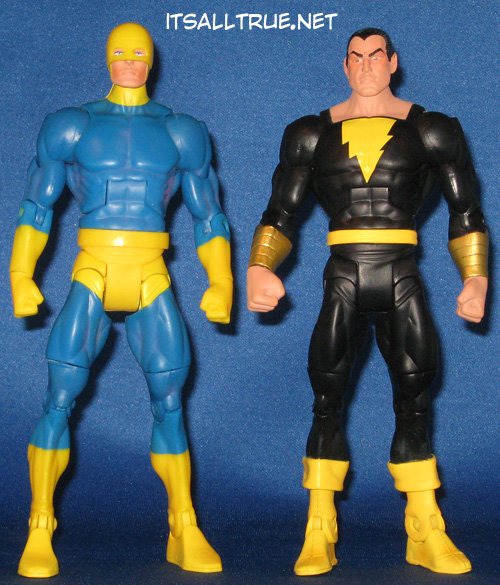
As much as Black Canary and Green Arrow featured new parts, these guys are fairly standard. Hey, the waves gotta cost out, right? And these two are excellent examples of where the standard bucks can get the job done. For both, only a new head was needed. The rest of Guardian is one of the standard bucks while Black Adam makes use of Captain Marvel’s belt, boots, and gauntlets.
Guardian’s head is another one of those examples that remind you how great these figures are conceived (and even better if executed properly). Instead of trying to paint his eyes inside the helmet, the whole assembly is two pieces: the head and a separate helmet piece. This works great for two reasons. One, the paint apps are clean, and two, it really gives the figure depth. Many figures feature a dark wash or some thin black paint in an area where shadow is needed – that doesn’t have to happen here because of the separate helmet. It really makes what might be a run of the mill figure sing.
Black Adam features Captain Marvel’s unique parts for accuracy, but it’s the head that really had to sell the figure. It does. He looks appropriately judgmental. This is a figure that is convinced he’s better than the others.

Guardian’s paint scheme is a bit of an issue. I don’t mind the blue/yellow combination and I’ll avoid the gold/yellow debate for today. No, the issue with his paint scheme is the tease Mattel gave us early on. They originally showed the modern costume. The intention was for the final version to be variants with the modern one, but this was scrapped do to cost (likely over accessories – they would need two different shields). The one we have looks great, but having picked up comics around the time Superman died, I’m always partial to the clone Jim Harper over the original (where’s my DCUC Gangbuster??). I’d like to see that version of Guardian as an All-Star at some point. Still, the figure we have is painted well with a great face and crisp lines where the yellow and blue meet up.
Black Adam is painted well too. Similarly, he doesn’t need much, just some sharp yellow in the right places. One of the issues we had was with how the lightning bolt symbol is painted. We know that it is accurate to some of the control art for the character, but that doesn’t make it completely okay in our book. It just looks strange since we’re used to symmetrical lightning bolts. We can live with it though.
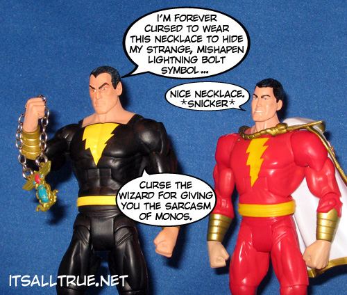
Both figures come with an accessory! Gasp! Yep, we checked and this is still DC Classics. Hopefully, it’s the sign of a growing trend. Guardian has his trademark shield. The shield did come a little scratched up, but the color and the shape are great. The separate straps are textured and painted to give a leather look – a nice touch. Black Adam includes his trademark necklace. It’s comic accurate and painted well, but it’s still going in the extras drawer. The necklace is the go-to accessory for this guy since it’s pivotal to his classic character, but with the more modern misshapen symbol, a black Marvel cape would’ve been a nice addition too.

Overall, these are two more solid figures to populate the wave. Black Adam is one of DC’s premiere villains, even if he is a little below the radar. His figure is clean, simple and executed well. Plus, he gets us more Marvel family and that’s always good.
Guardian is a real sleeper in this wave. You’re probably buying him for the Chemo part, but his simple color scheme and his perfect execution really make you give him a second look. In the end, both figures are quality DC Classics, but will probably get regulated to the middle of the shelf just based on who they are.
Guardian is too funskool for me.
LOL. That’s a great description of his colors.
Solid review. I totally agree about Black Adam’s excellent visage – the only figure I can think of that’s more disdainful is the NECA Akuma figure.
I don’t have quite the same appreciation for Guardian though – I’d have preferred the more muscular body along with at least a metallic shield. Though Noisy does raise an excellent idea to release improved updates/variants as All-Stars.
Thanks!
I need to spend some time on the figures and categorize the bucks. That way, like you point out, we could have a dialogue about which bucks might be better for certain figures.
The Guardian has become one of my favorite figures in the entire line. His simple design is really endearing. Same goes for Wildcat.
He really surprised me.
The gold/yellow clashing bothers me to no end.
The annoying thing about Guardian is that, while trying to serve two masters, Mattel missed the boat and didn’t do a true Kirby Guardian or a modern one.
I would have wanted a Kirby one less.
I really want a Manhattan one, truth be told.
Good review.
I still can’t find this wave myself. I may have to give up and eBay after all.
It really depends on TRU and if they’re just going to have empty pegs until 11 hits.
His symbol threw me for a little bit. I had to look it up and sure enough they draw it that wat too. Whatever.
That’s exactly what I did. I still wish they went traditional.
I got to play with the Guardian and I have to say that, compared to other figures in the line, his range of motion is really good. The sculpt and paint on this one were nice, too. It’s such a simple paint job that you try not to look twice at it, but it really is well done. And, hey, he can look up! Bonus!
Hotel room boredom, folks. LOL
Ahhh… When you told me you replied I had assumed it would be serious. I should know better by now.
I wasn’t really caring about Guardian, but I have to admit, after I got him, I was very impressed. His helmet/head is perfect.
The all-yellow really brings it out too.
Captain Marvel is such a bastard.
He really is.
Guardian looks cool! I like the bright colors.
Me too!
Why does he have that necklace?
In the Ordway Marvel Family reboot, Adam is stripped of his powers in ancient times and they’re sealed in the necklace.
I only bought Guardian to get the Chemo leg, but I still really like him though.
How do you like your Chemo?