
But I was happy with the Battle Stands overall, and for a moment the options really opened up. Fright Zone stands? Snake Mountain. Whispering Woods. Eternos. If we couldn’t have playsets, we could at least carpet the shelving (and maybe forgo all the pegs and let the figure roam free). So when Snake Mountain Stands came out! Woo!!

At least until they got here. To be fair, I had some reservations when they were revealed at PowerCon. The 4H protos weren’t quite purple enough, and the lava didn’t make a ton of sense, but the little streams flowing in the crags looked cool. The allure was there. But the actual product may vary.

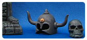
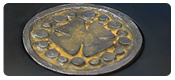
On the final versions, Mattel just didn’t translate what little awesomeness the 4H had given these stands. They ended up looking almost straight black. The lava paint app was reduced to a corner puddle (if you lay the stands near each other you can kinda get a lava red cross). And the rocky outcropping attachment became a mostly unattached weird piece.
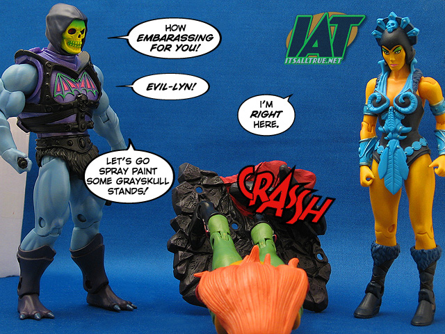
So, really, the aesthetics that had been the saving grace for me on the Battle Stands became a giant weight around the neck of the Snake Mountain stands. They just don’t look cool. Heck, they almost make you wish Mattel had saved some coin and released the Battle Stands in purple instead. Ouch.

Alright, let’s cut it there before I say something mean. To me, this is just one of those instances where we asked Mattel for something in particular and they didn’t quite get the message. Looking at next month’s stand offering, this won’t be the last time either.
If you bought these and loved them, my hat’s off to you. I wish I didn’t.
Recent Reviews:
 |
 |
 |
 |
 |
 |
For all our MOTU reviews, check out our
MOTU Classics Collector’s Guide.
Yeah, I could do without the multiple holes, the lava paint app, and the attachment. Purple Grayskull stands would have done the trick quite nicely. Easy pass for me as well.
I don’t know, I like hole options. 🙂
giggity!
so…they don’t work well with MOTU, but what about other lines?
and just checked the Matty page to see what was coming next.
two words to keep in mind: ’68 Olympics. 😉
Hi Noisy,
The scenes are really funny. The only thing good to come from these stands were your gag lines. 😉
-Tim
Great review and hilarious comics, if nothing else!
They’re lousy stands but they make pretty good trim. I line the stands up at the forefront of my display shelves and they look great. AND they help block shelf diving!
Octavia you drink too much. Nobody brave enough to carry her or is that skirt now in the way of that?
A nice review and funny pics. Man wish these woulda been cool. 🙁 oh well.
I have to rant. I do. Pardon me.
Is there ANY logic with how Mattel does this stuff? I really cannot fathom it. I can’t. Here we are, pretty much assuming it’s ‘end of teh lein’ time, and they throw design money and tooling budget and all the logistics on these stands? When popular thinking, ‘redoing the first stands in purple’ was perfectly fine?
And then on TOP of that they pretty much FAIL as stands?!
The hell?!
So, is it just a case of bureaucracy in action, embedded failure on parade? A ‘use it or lose it you can’t move it’ accounting system? Manatees in charge?
*sigh*
Another great article, Noisy. I do appreciate all the work you put into this stuff. 🙂
You were in fine form in this review. Only you can take a review for something as boring as these not-so-great stands and make it massively entertaining. 🙂