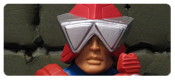
Thinking along those same lines, I also love the crystalline look to the wings. I’m still not sure how I feel about how the wings were engineered, but it worked really well on my regular Sorceress. On my ToD Sorceress, it seems that the upper most part of the wing/cape is glue in place, and moreover, glued crooked. I’m not sure if my original was supposed to be glued and isn’t or if the new one is jacked, but gluing the top one in place is a bad move. I know the giant “drums” on her back hurt the figure for some folks, but I don’t mind them too much – as long as she can sit on the Castle Grayskull throne without incident.
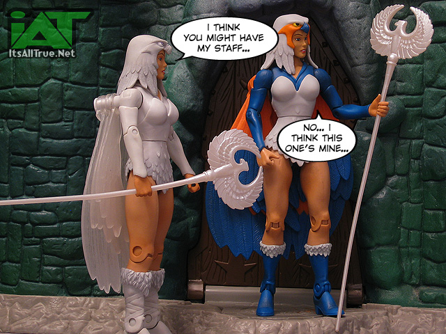
ToD Sorceress included two accessories. First up, the same white staff as the original. I was slightly disappointed by this one. I know of my readers cringe at this thought, but I’m never a fan of duplicate accessories. I still think that Dragon Blaster Skeletor would’ve been better with a sword painted to match his armor and I think this Sorceress could’ve gotten a few more style points if she had a unique color on the staff, whether it was flat white, partially powered up, gold, etc. (And, yes, I’m such a nerd for fun recolors, I’ll be buying that 30th Anniversary MOTU DVD set (affiliate link) just to get that gold Power Sword. Ugh!)
The other accessory is/was a major draw for the figure, I’d imagine. When Mattel reissued King Grayskull in 2010, they gave him a new accessory – the Orb of Power. Really, it was a blue plastic marble, but it was cool – except that it just rolled whever. ToD Sorceress includes an Orb Stand so that lil’ marble can have a home in our displays. It’s an excellently sculpted piece with fun little easter eggs on it. Before I knew how much I’d like the figure, this was my main reason for needing to pick it up! Castle Grayskull is currently scheduled to include a smaller orb stand, which does render this guy slightly more moot, but I still intend to make use of this stand somewhere in the Castle.
Overall, ToD Sorceress turned out a pretty swanky figure. She’s not crucial to the line by any means, making her an excellent candidate for Mattel’s “Travelling Convention Figure” (re: any show they attended this year that wasn’t SDCC, and some overseas cons they didn’t). You definitely don’t need an all-white Sorceress unless you’re a completist or if you just really want one. Also, props to Mattel for also planning to sell her later this year on Mattycollector instead of just making her available at the shows. I think we take that granted for some times, but it wasn’t the norm just a few years ago.
Ultimately, ToD Sorceress takes a nice figure and gives it a nice repaint, adds back in some articulation, and includes a fun new accessory. You can’t beat that. I’m going to have to find a spot for both of the Sorceresses on my shelves. This new one is too cool to pack away.
For more MOTU reviews, check out our
MOTU Classics Collector’s Guide.
 |
 |
 |
 |
 |
 |
Funny thing for me with this version. All the books I had she was pink not white. I know some folk out there are using her as Vikor’s sorceress but like the spirit idea alot more.
Couldn’t find an original one at CTS this year and was stunned since last year some one had a table full of MOTUCs but, how things go I guess. That seller maybe couldn’t make it. Will be hunting both versions down.
I’ve seen the pink one. Some collectors have suggested a third repaint. Whew…
Good luck in your search!
Nice to know about DVD set… Too bad they don’t do a Blu-Ray version, it’s about time and would be in our shelves forever (at least more time than any DVD)
Not everything needs to be “updated” to bluray. At least you can still play dvds on bluray, but whatever the next technology “advancement” is, I don’t think they will be compatible, like the previous VHS to DVD jump. I’m thinking along the lines of memory sticks or SD cards, imo. I think their size is the only thing preventing that jump, as they’ll have to come in larger packaging (greeting card/motion comic-sized covers?) and/or held in lockable cabinets in stores like video games are to help prevent theft.
There are things that just don’t work well on Blu-Ray and animation, especially Television animation is one of them.
I swear, I just don’t understand why people have this faith in the ‘magic’ of the NEXT NEW THING into turning something adequate into something it’s not. I recall when DVD came along, suddenly people were assuming, ASSUMING mind, that suddenly cartoons made and formatted for TV would magically turn into super widescreen. It doesn’t work that way.
The key limitation is the very resolution of what’s being put on the disc. A major movie shot on film has an amazing amount of information embedded. A cartoon can only show you what was painted on the cel. There’s no depth.
So with MOTU we have an old cartoon, shot (I believe) on 16mm film, and at some point transferred to digital tape in PAL format. There’s such a number of barriers there it’s frankly amazing that the DVDs look halfway decent.
DVD is a decent, stable format that is able to provide high quality video, the key being not to compress the material to death (i.e. trying to cram a dozen half-hour cartoons on a DVD-9)
And Brainlock, from all reports in the industry, BD is the last physical format. According to Hollywood, ‘nobody’ really WANTS physical media anymore, Video-On-Demand/Streaming is the future because ‘everybody’ has super-fat broadband and/or they want to watch on their smartphone.
Yes, I suspect you are like me in the eye-rolling department at that though process. 🙂
People are fine with physical media. It’s the cost and the perceived value that’s the issue nowadays, and I think most people feel anything more than $10 for a movie on DVD, $20 for a TV series, is just paying too much.
When people start talking about “upgrading” shows to Blu Ray, I’m always reminded of something I read years ago about the original Star Trek series. The people responsible for mastering the show for DVD admitted that they were not able to make use of the image resolution and sound quality of DVD. Which makes sense. It was, at that point, a nearly 40 year old TV show that was filmed on videotape. Paramount did, of course, later go back and “remaster” the show, Special Editon style, and release a Blu Ray version of the series, but the elements of the show that were original, ie the actors, sets, etc., look no better than they have on broadcast for the last few decades.
TNG is a slightly different story, since that show was filmed on film and then edited on videotape, so the original film elements still exist, they just have to be re-compiled into the final episode format.
Though honestly, I don’t like Blu Ray, or hi-def. Anything that’s not real, ie special effects, etc., just look terrible. It’s even more apparent than it was on DVD, VHS, or i nthe theaters which elements are actually there and which are not. And watching older material not created with HD in mind brings out all kinds of things that you were never meant to see. I’ve only seen a couple minutes of Back to the Future, and all I could see the whole time was that mole above Michael J Fox’s lip that I’d never noticed before and that they’d clearly put makeup over because in 1985, that’s all they had to do to obscure it. They never thought that 25 years later there’d be a new home video format that would enhance all those little details.
I just finished up a re-watch of TOS the other day and the shuttle in space scenes are laughable, and the shots of the Enterprise have more bad CGI than “okay” shots, imo. They did outdo themselves on the various planets, but one of the last half dozen I watched as Hurricane Sandy rolled in had an even larger spiral cloud on a planet than Sandy or Katrina ever got close to.
and yeah, Noisy, I don’t have a bluray OR a flatscreen TV, either. 😉
I still don’t have Blu Ray player… lol
She looks cool, but a pass for me. I think the biggest problem/sticking point for me is the way those wings are attached. I probably would have gone with a plug on the back, with ratcheted wings to lock into place, maybe a cuff on the wing to clip onto the wrist? If not a vinyl sheet or (horror!) soft good material for the wings.
Also, maybe it’s just me, but being a classic NTT fan, while reading this review I can’t help but think of the various looks Raven has had over the years, from her basic dark blues which we did get, to ghostly yellow, her red skinned, Trigon-possessed look, and after that, her “purified” white costume. Too bad DC and Matty screwed up, and have forced the nu52 on us (where I don’t think she’s shown up yet?), so we’ll likely never get ghost-yellow or even Trigon-Raven figures. :/
(and yes, I’m still sore about never getting the “soul self” accessory!)
*(not even going to mention the “Trigon Seed” mummy rags stripper look!)
can you link me a photo of that last one… for research, yeah, that’s it, research.
the orb stand is lame, and i’ll tell you why… firstly, the orb is lame, and an accessory to a lame accessory is, by fiat, completely lame. secondly, they’ve already made it obsolete by selling us a 250 dollar orb stand that is not, by any stretch of the imagination, lame… thereby relegating this POS to further lame.
that said, i like the look of this sorcesess, i like articulation, and i like clear figure bits, so you’d think i’d be all over this figure like a soap scum on a tub, right? she’s not for me lads. i can’t really explain it, i don’t have the “vintage redux” sorceress, so she’s not competing w/ a fig i already have, and i like the sorceress as a character, so it’s not like i can’t find a reason to buy her, i just don’t feel compelled. i honestly think it’s partially budget and partially interest and partially company politics… the fringe characters, those on the fence, they who straddle the great divide of “gotta have it!” and “i really like that.” have pretty much all fallen off the fence on the side of “eh.” especially as they entice me w/ a big ticket purchase, the toy budget kinds less and less reason to cough up for the also-rans. imagine how much worse that will get when the price hike kicks in?
one final note… as we approach the saturnalia buying season, and the advertising circulars make their rounds, does anyone else catch themselves oggling the dollhouses and noting that the cost is like half to two thirds that of castle grayskull? i know, there’s a litany of reasons why the castle costs more, but it kinds of rings hollow when you’re looking at a 42 inch doll castle complete with appliances for half the cost you’re being asked for a plastic castle. i made my pre-order, and i’m comfortable in having done so, but, well… i look at other women too. it’s all i do, but i do look. and i look at other playsets.
http://3.bp.blogspot.com/_RVLJm9IHkZk/TD5KTSntYTI/AAAAAAAABaw/vsxpW4K8nKw/s1600/nt118-022+-+Copy.JPG
that is just awful… i was hoping for something sexier and less… dumb.
Maroon just became my new favourite colour for some reason.
I honestly think Raven is the dead girl you see in Red Hood #1. If that is true once again I say FU didio for axeing another fun character in the relaunch we were forced into. (Avoided flashpoint I did)
I think Raven’s shown up in “Phantom Stranger” (haven’t read the book, since I thought the premise was incredibly lame and Dan DiDio’s writing it), and she was said to appear in Titans in the most recent Previews catalogue, so she should be showing up there in about 3 months.
Honestly, it’s shameful how DC’s treated the various members of the Titans since the reboot. TT was their #1 book for the better part of the 80s, and here’s how the membership is doing:
Nightwing: virtually unchanged. Costume is now lamer, though
Starfire: Brainless sex toy for Red Hood and Arsenal, memory of a goldfish, can’t tell humans apart
Donna Troy: Doesn’t exist
Wally West: Doesn’t exist
Beast Boy: Emotionally damaged experiment forced to fight other metahuman teens in a “Battle Royale”-esque death match
Aqualad: Hasn’t been mentioned
Roy Harper: Deadbeat stoner mercenary
Cyborg: Forced into Justice League origin
The translucent wings and pedestal look awesome. The paint on her face looks a bit caked, though. Is that a common problem with her?
Great review as always!
It was a bit heavy on her! I forget to mention that. My normal Sorceress also has a painted face and is fine, so it’s probably just a small QC issue.
This looks originates from the mini-comics included with the figures, most notably the “Temple of Darkness” mini-comic which was packaged with some of the 1984 MOTU figures. I’m not sure if the all-white Sorceress was a design choice or lazy coloring (non-coloring?), a quick look of that issue at He-Man.Org reveals a pink Teela, white-mustached Man-At-Arms, and Skeletor rocking a swanky pair of gloves.
Huh. I had no idea about this minicomic origin. I thought she was based on the Sorceress as seen in the Dolph Lundgren movie.
you mean ross and monica’s mom?
wait, so this movie was a pre-Friends set-up? Next you’ll be telling me her boyfriend joined Starfleet!
This just twisted my brain into a pretzel!
Glad your TODS arrived safely.
Great review!
I think when Grayskull comes out next year we should do a multi site MOTUC theme week
Thank you again!! 😀
And I’m down for coordinated theme weeks!
Great review!
I really want to like these Sorceress figures, but the drums do kill it for me.
Something that looks so blatantly toy-like just doesn’t mesh with the kind of MOTUC set I’m keeping around.
Good thing this line wasn’t gonna have action feature-created unsightly knobs and levers like the horribly inferior 200x line, no?
I tend to overlook them on automatic, but it’s a shame there wasn’t a cleaner way. I guess the line’s usual way of solving it would’ve been a draped and an open “cape”.
And thanks!
I don’t understand the big deal with hiding articulation joints. So what if the old MOTUC female hips were “unsightly?” Real knees don’t look like that either!
The new hips are the one reason Battleground Teela went from “Can’t wait to get her!” to “pose her and put her in the back.”
holy crap ain’t that the truth. i liked BBT until i started trying to pose her legs.
also agreed, the knees and elbows aren’t something people are clamoring to get remade to equate a better range of motion, nor better appearance, so why hiding the hips was a priority i don’t know.
also, noisy didn’t really bring this up, but how is the armor? the biggest problem i have w/ the articulation, especially the hips, is when the loincloth is so stiff the character can’t really raise or lower their legs. is this feathered snizz cover adequate to let her raise her limbs into a decent seated pose?
The feathers are soft enough for her to sit.
And agreed on Teela, Battle Catman. I hate the new legs.
Great review. The knobs in the tod sorceress seem less obtrusive. Perhaps its because they are virtually the same color as the rest of the figure, or i am just used to ignoring the translucent elements of my toys. I do love the stand (which may or may not become worthless) overall i am happy to have the figure
Thanks! I think she’s pretty cool.
I’m wondering if the star seed or whatever that comes with procrustus would fit in the orb holder? It appears from seeing it at NYCC to be bigger than the orb, but may still rest nice in the stand which would make up for the stand becoming useless once CG comes out
I wonder if it’s bigger or not? Does he use Megator’s hands? We might be able to do some in-home testing…
I brought 2 of the TOD Sorceress and I still prefer the original color than the white version. Cool that we got the stand to display the orb of power on. I love new paint jobs you did with your custom TOD Sorceresses also.
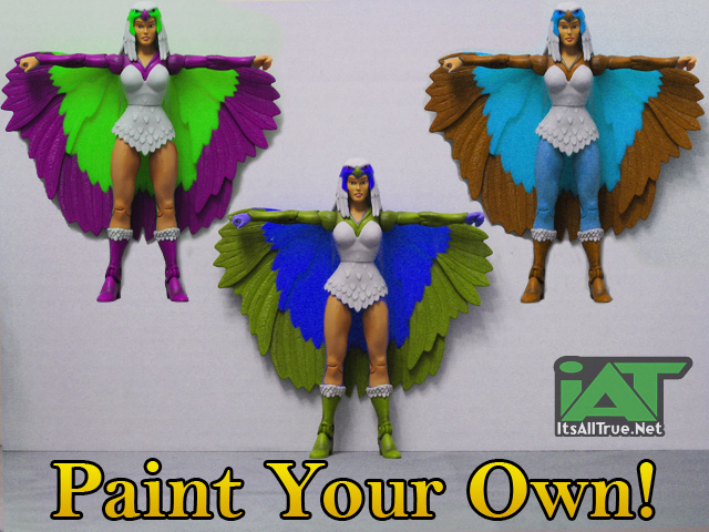
Thanks! The purple/green is my favorite I think.
Excellent review, great pics! (Natch.)
I hope to be getting this when it becomes available on MattyCollector, but I still hate those damned Frankenstein bolts in her shoulders. One o’ these days, I’ll have to get caught up on my soft-goods replacements, because I’m getting ridicuously behind. Like about four years behind!
LOL Make time!
Thanks!
I love that last picture with the crazy colors, especially the purple and green one!
Thanks!
Bird Bath for Zoar… Said it before and I say it again… Also, a long time ago I took 2 cake pillars and painted them green (cause I bought 2 KG 2.0… one to be KG, the other 200X He-Man) they hold the Blue ball(s) of Power perfectly so this holder is useless to me… doubly useless if CG gets made and I order one.
The one in the Castle does invalidate this one, but this is an “Exclusive” one so it’s probably okay.
Sorceress looks mighty nice in white. I’ll try and grab her if she pops up on the Matty site next month.