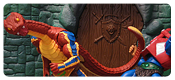
 Admittedly, I’m not the biggest Snakemen fan. In fact, I can’t even recall having a single Snakeman as a kid. I picked up all the MO2K Snakemen, but they didn’t do much to convince me. I’ve been hoping that Classics could warm my opinion of these cold-blooded villains.
Well, I shouldn’t say I didn’t have any Snakemen as a kid; I absolutely love Kobra Khan. He’s still one of my favorite vintage figures, I’m still bummed that I couldn’t get him in staction form, and his Classics figure will be forever in my Top 5. But… Kobra Khan has never really been a Snakeman in my eyes. He’s always been in service of Skeletor if you ask me and that really hasn’t changed over the years despite the various canons.
Anyway, with Kobra Khan out on a technicality, Classics hasn’t had much to go on. King Hssss has never really won me over. Snake MAA was quickly cannibalized into the greatest Man-At-Arms figure ever. The Snakemen 2pk is probably the best addition to the Snakemen ranks, but I wanted more from that set. And Rattlor? Well, he’s really the closest the Snakemen have come to being cool for me.
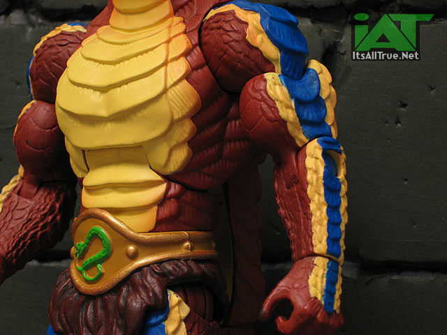
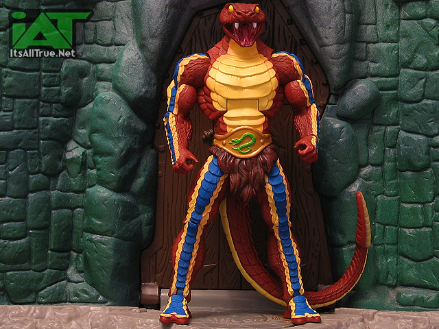
The overall sculpt, shared with its “pre-paint” in the Snakemen 2pk is damn impressive. I look at the body of the figure and I kinda find myself cursing how much shared tooling the line needs to stay healthy. Toy Guru often talks about this being the greatest iteration of MOTU in figure form – that’s debatable, but if more figures could feature this much “unique” sculpting, it’d be a much simpler debate. The scale work is fantastic; there’s ton of detail all over the figure. It’s sharp. The new loin cloth with the snake belt looks good. The tail is good. There’s a lot to like on this sculpt.
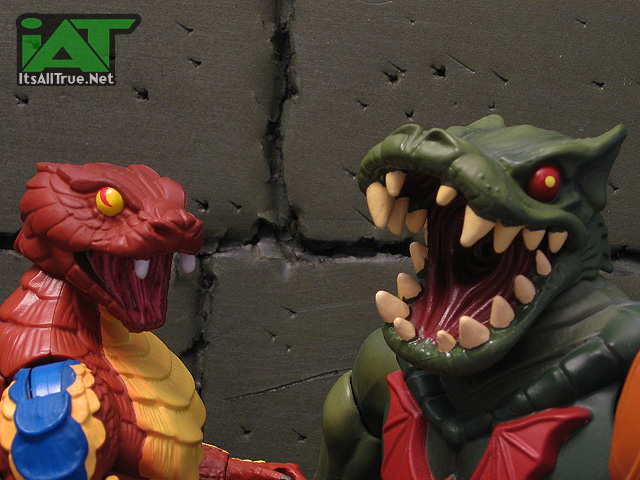
But the head drives me nuts. Partially, it’s the open mouth. Years ago when one of my all-time favorite DC characters, Firestorm, was getting a screaming sculpt – the internet chatter got a little loud and the 4H grabbed things by the reigns and resculpted it. I have forever been grateful to them for that (and for many other things since), but it really saved one of my most wanted figures. I’m just not into open mouth sculpts (this might explain why Snakemen figures are a hard sell for me). The Snakemen as a group just look like they’re going “Wasssssuppp!” all the time. I don’t know that I would’ve wanted tooling money wasted on a closed-mouth head or a hinged jaw, but I know I’d like Rattlor better if I could shut his mouth once in awhile.
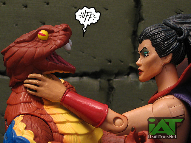
This is particularly true when combined with the paint. The way the eyes are painted I can only ever see him like his eyes are bugging out as he’s being strangled or like he’s waiting for praise after a bad pun. Either way, what it’s not is scary. Now, I don’t need a creepy Geiger-esque McFarlane Snakemen (but we all know the 4H could do it!) – that wouldn’t fit in with the line, but it’d be nice if this right-hand snakeman could look like a credible threat. His tail rattles, that’s menacing and all, but Rattlor should make some of the Heroic Masters mess their furry shorts. This head sculpt isn’t that.
The rest of the paint work, other than being marred by the black plastic underneath (which does show through in some areas), is spectacular. It works in tandem with the sculpt to sell the figure. The color palette for Rattlor has always been fantastic and the intricate paint work on the Classics figure takes it to a new level. Continue to Page 2…
Gotta say..this is one of the best MOTUC reviews on IAT in terms of humor in pics
loved every single one of them! 🙂
Thanks, bmnbinc!
Excellent review, pics, and comics, as always!
What bugs me about Rattlor’s eyes is the angle of the pupils: they’re supposed to be vertical, and I’ve seen samples online (my Rattlors haven’t arrived yet) with various cants all the way to near-horizontal. Other than that, there’s not a lot else one can do to sculpt the eyes of a creature that doesn’t have eyelids.
As an issue, though, paint would probably be the biggest for me. Besides the paint-over-black-plastic hoo-ha, his rattle should really be a glossy ivory, instead of two-tone. I will be fixing that, you betcha.
And, yeah, the vintage Horde mostly had unique crossbows. I think Dragstor re-used Mantnenna’s, though.
Thanks, Beedo!
I wasn’t sure if the vintage guys all had unique crossbows. And now you raise a new point – Dragstor needs a unique crossbow – I’m not in favor of him just getting Mantenna’s so it’s “just like we remember!”
Still waiting for my Rattlor turn up – but he seriously looks amazing – I think this may be the MOTUC figure of the year for me – based on pics alone.
I just hope Mattel STOPS using the black plastic – I want to pose my Rattlor so the joints will rub and show black plastic. Why do they use it? It really is mind boggling.
using regrind plastic is a cost saving measure… and some would argue it’s also a form of recycling (which it is, in a technical sense)
We don’t have any evidence that black plastic is regrind plastic. The impetus for cost savings on the black plastic was the ability to run much larger batches of the individual pieces in a uniform color. The regrind plastic is still fan speculation as far I know.
true, but regrind is a regular feature of the plastics industry… and it comes out black. i suppose that could be coincidence… and perhaps those black folks on dutch sailing vessels were all stowaways.
Black plastic aside ( stupid idea I agree) I dig this guy since likes him as a kid but admit not a fan of snakes in general. Glad we had the rattle, the pic with Mekaneck is good fun. Enjoyed the review, a nice mood lifter right now.
Thanks!
As I only collects POP characters (sort of)I was going to get one of these to go with my horde display but I missed out on the day of sale. After looking at your review I’m still not sure if I should be upset at missing out or not.
Anybody else notice Matty isn’t doing any MOTUC reissues this month only the essentials stuff.
Scott said they were assessing inventory levels. It sounds like they’ve mostly burned through their leftovers.
I %100 with you on the opened mouths. I really wish this guy was sculpted with a closed mouth. It would have been a good way to include a “classicized” version of his Millennium head.
A closed MO2K head is a great idea!
I can see freaky lady bits in their open mouths…
I gave the armband to HH now he looks more Filmationy… The staff is property of Hsss… now My Rattlor is weaponless… Any suggestions (not from the snake Army builder cause I don’t have it)?
holy crap what kind of ladies have you been with?? 😉
i love the chest piece, i love the arms and legs, the sculptural detail is great… that said, the much vaunted paint aps leave me a little “eh.” on mine, some of the blue clearly bled over before some of the yellow was laid, so i have several green spots that aren’t green in a good way. and the mass of red scales that covers his whole back has no shading or wash to make that detail pop. not a difficult thing to remedy on my end, but not an excusable oversight on a fig who’s talking point to solicit sales was his paint job.
now, i would like to counter the open mouth theory w/ one of my own… had we gotten only a closed mouth head, everyone and their brother would be pointing out that a major fear element of serpent symbolism is their venom, and they need to strike (w/ open mouths) to deliver it. there is something deep in our unconscious programmed to fear a striking snake for the sake of survival. the answer, at least on the snake men, was not to include closed mouths, that would have been dull and boring, the answer was to let the horsemen “real up” the sculpting a bit and make those open mouths really look like a weapon to be feared… which they should be. rattlor in particular needs an open mouth, if you put a closed mouth on the extended head, he’d come out looking about as dangerous as falcor.
Freaky ladies… who may have committed some unnatural acts between man and beast.
I’m more of a two heads for the snakemen kind of guy… (spoiled by Japanese figures with their swappable faceplates and hands) I understand WHY the snakes come with open maws, but Mattel’s safety rules made them less threatening. Then again if I was in charge I would’ve fought for multiple heads AND hands for each figure!
A hinged jaw or two heads would’ve been better. The extending neck does need a screaming mouth. I’m just tired of all the hissing….
Considering how wide real pit-vipers open their mouths during a strike, this Rattlor ain’t too bad. Could be worse: he could have a 170-degree gape and have even more problems seeing straight ahead than Leech. };D
Rattlor’s color palette has always been one of my all-time favorite color schemes for action figures. Period. I’m serious, there’s something about that brown with muted blue and some sandy yellow that just looks excellent.
Oddly, one of the things I’m most excited about for this version of Rattlor? The fact that his tail is properly sculpted all-round. See, the vintage figure had this tail which had only one side, the underside was just a hollowed-out shell. This one is all three-dee baby, and I love it.
Great review as always!
Huh! I’ve never looked at the vintage one closely. How weird.
And thanks!
Yeah, the new tail looks good, but the original Whiplash had the same hollow-tail weirdness, too, so I took Rattlor’s in stride.
What freaked me out about the Vintage Rattlor most (there were a number of things, but this was the worst): He had perfectly human hands, and was apparently wearing leather gauntlets made up of his own hide. Or the skin of one of his relatives. I cannot now look at the Vintage Rattlor without imagine him saying, “It rubsss the lotion on itsss ssskin and putsss the bottle back in the bucket.”
Paint-on-black and lack of action feature aside, this version of Rattlor looks far better to me than the original. Roll on the next Missing Weapons Pack!
His bright colors separates him from everyone. Cool that he has the neck attachment like Mekaneck but me it would look so better with his 200x armor.
Cool review as always.
After seeing it on the picture Mattel posted, the figure looks naked without it now. I don’t have my MO2K Rattlor to steal it from anymore, but they ended up very similar.
Does the arm band actually fit over Cy-Chop’s elbow pads? That MIGHT be enough to convince me on him.
Mine is on Horde Prime at the moment.
Yes. My Cy-Chop is sporting it right now.
Awesome pics noisy!
I’m with ya on the accessories
sorry, I couldn’t get this one. the Brown/Cream/Blue paint apps look gaudy and gives the illusion that he appears skinnier than other figures.
I wanted to like it but I think the 200x update to him is one of the few time i think looks better than the classic.
For what it’s worth, Rattlor looks all kinds of awesome with the red armor, shield, and sword from the snake men 2-pack. When he first arrived, I put the 200x armor and belt on him from The General, and while it did look cool, he looks better with the 2-pack weapons. If you’re not happy with him as is, I highly recommend the look.
Okay thought came to me thanks to recalling the 200x series. What if Rattlor camebwith a head with victims feetvsticking out of it. That or a Hiss head with a whiplash tail sticking out.
Rattlor is one of those guys that made me wish I hadn’t given up on the line so early on as a kid. I love his red, blue, and yellow color rainbow. An awesome figure with neat-o action features.
Neck-down, Rattlor is awesome (as he should be – aside from the loincloth and hips, as far as I can tell, he’s all-new! Yay! Not including that snake minion from the 2-pack, since the tooling was clearly intended first for Rattlor or at least with him in mind).
But that head! Eugh. It’s like a cat. An angry, toothless, malformed cat.
My favourite bit though – which I only discovered after his tail came off trying to pose him – the tail actually rattles! Fun.