
 As most of you know, Matty’s August high jinks cost us our Club Eternia subscriptions here at IAT, not to mention the August items, Man-E-Faces & Megator. With so many new toys being released since then, Man-E-Faces fell by the wayside until an IAT reader wrote in to save the day.
Before I get into the nitty-gritty of the review, I have got to give a huge shout out and thank you to one of our young readers, Albert! Albert & his dad had an extra Man-E-Faces and got in touch with me after reading about the problems I’d had picking one up. So, a quick shout out to Albert & his family. This review wouldn’t be possible without you! Thank you!

In addition to my slightly longer wait, Man-E-Faces has been one of my most anticipated figures in the line. The novelty of his having three faces has never quite worn off for me. I loved the original figure (& was overjoyed that it survived The Great Flood™), I loved his MO2K update (another huge shout out on that one, it was my future wife that managed to snag me that figure when I absolutely couldn’t find it), and I was more than ready for his MOTU Classics version to finish off the trio. The only reservation I had was that not all the folks behind the scenes were as interested in replicating the original toy as I was…

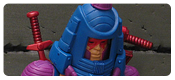
Back in the early 80s, Man-E-Faces’ toy ended up being a bit different from his original cross-sell art on the back of the package. Almost thirty years later, that change to the final product would take the form of a fan poll to decide how the modern iteration of the figure should look: like the old toy, like the old art, or a compromise between the two. Only 1200 or so votes were cast (having to be a member of the Matty forums prolly didn’t help all that much) and nearly half the folks chose the compromise option.

Initially, I thought the compromise might be a good idea, but really, anything that downplayed the orange on the classic toy was just going to turn the figure into cross-sell art anyway. And that’s what I feel like happened here. We may have felt like we were voting on flesh, mix, or orange, but we were really voting on flesh tone, or orange. Now, maybe that’s what the voters quicker than me realized when they cast their vote, but I will always wonder how the vote might’ve gone if the “great compromise” hadn’t been listed as an option. Would we have all voted for the new figure to not look like the old one? I don’t know.

I won’t lie. It does bug me a little bit that Man-E-Faces isn’t “just like we remember”, but I think it’s more about me feeling damned either way at this point. Figures that I was really excited to see some MO2K influence on like Snout Spout ended up being little more than upgraded vintage figures while a figure I would’ve been more than happy to see receive a vintage upgrade ended up being booted all the way back to the conception art. It doesn’t ruin the figure, but I can’t help but feel I’m waiting for a repaint at times – and with the TRU 2pks dead in the water, that’s not likely to happen.

Man-E-Faces features a healthy amount of part re-use to get the job done, everything from the bicep swivels and ab crunch down hails from another figure, mostly Trap Jaw with some Optikk undies. Man-E-Faces received some new shoulders, a new upper torso, hoses/harness, head, and helmet. I would’ve liked to see the details on the original figure’s helmet/suit “seam” and the design on the shoulders carry over to this figure, but those aren’t missed opportunities since the sculpt was seeking to replicate the cardback.
As a quick aside, is anyone else feeling like the limbs are softer these last few releases? I don’t know if it’s me and I’m going crazy, but the figure seems a little less sturdy than past releases. Are any of you experiencing that?

The centerpiece of the Man-E-Faces is the new head though. It’s one of the coolest action features a figure can have and I loved changing the vintage figures face (& personality) as a kid. The funny thing is that I could never pick a favorite. The regular face was to be respected as Man-E-Faces’ original, of course, but the beast & robot faces were equally exciting and really made the figure memorable. The same can be said for the Classics figure as those original three faces are all represented, but the Classics figure also gave us a little more in the guise of a “secret accessory”. Continue to Page 2
how hong have I waited for this review..thanks Albert!
MEF is an awesome figure, I caved and bought 6 of him, just to display all of the 6 heads 🙂
Are you kidding? 6 MEFs!?! That’s awesome. LOL
The exercise bike bit… Is it a reference to the MEF Vintage ad?
On the Figure: While I hate the Snooki Orange that vintage and 200X toys had, I found MOTUC MEF to be a bit too pale, so I gave him a slight orange wash (Except face and hands) now he looks a tad better. I also painted the eyes white. Skeletor had a visit from yellow paint cause he’s too green!
I think he kinda looks like Dan Akroyd.
Other than the few color issues I think he’s an awesome figure!
“He-man, he’s your friend?”
“Friend and ally. Yeah, he’s just kind of weird sometimes.”
“Oh.”
Awesome touch, Noisy.
Thanks! And thanks for the transcript too! 😉
You are correct, sir! I sometimes think of weird things while taking pictures…
The eyes being white would have to help sooo much. I’m so tempted, but I don’t usually mod figures I only have one of… He is definitely an awesome figure though!
If it weren’t for Toyguru’s meddling (he wanted the toy colors) that silly vote would’ve never existed.
NO ONE was asking for a “50/50” mix until that vote happened.
What fans WERE asking for was 2 separate deco releases.
Great review! Though it does bear mention how great that He-Man head sculpt looks cast in fleshtone plastic.
I kinda want to track down a double MEF to turn that extra head into my “go-to” He-Head.
I think the subscription kills that kind of possibility too. I’ve been thinking about that a lot for Poison Ivy and how the fans are split are her deco (and really the different decos need alt heads, but that’s another matter). It would be so simple for Mattel to just offer up the figure in green or flesh, but the subscription doesn’t allow for that. They can’t just change up part of the run like they normally would. I wish there was a good workaround that didn’t screw over the collector.
The easy subscription workaround would be to make the other deco one of the bonus figures the next year.
Or a “roaming” Con figure like the White Sorceress.
And again, what I also would’ve done was to make the Weapons Rack stuff all silver “realistic” colors and then put all the maroon ones in the 2nd MEF to have a true Man-E-Weapons release.
THAT is how you run a “collector’s line” . . . by catering to collectors, NOT trying to shoehorn what YOU wanna see.
As for Poison Ivy, they could do one in the subscription, and do the other in Batman Legacy or the DCUAS line. 🙂
For the most part, I agree with you, but if they were to go that route, I’d rather have had the Man-E-Weapons pieces in another Weapons Pak than buy another whole Man-E-Faces figure just to get the red armoury. Still, if they put out another Weapons Pak, there’s the possibility they’ll produce the remaining “Grayskull Rack” weapons for it . . . . Nah, that would make perfect sense.
I had low expectations for MEF and wasn’t planning on getting him at all, but I’m glad I did because he turned out great, IMHO. and I actually voted for the orange deco!
His pale skin is growing on me (just not with the He-Man head, with that one he looks like He-Man is even more into fetish wear than normal! 😀 )
MEF actually scared me when I was a kid. Great memories though
That’s awesome! I don’t know if I had too many scary toys. I did have to have a clown toy removed after watching Poltergeist at way too young an age… O.o
Glad you were able to score this fellow at last. Great review, with some pics that are even more excellent than usual! (The “Panthor Leaping” one, in particular.) But the Evil-Lyn head . . . that’s just way too distrubing for me. Sorry. The empty helmet look, though, is good ‘n’ creepy, and the Skeletor head peeking out of that helmet just makes me think “Who turned out the lights . . . ? Who turned out the lights . . . ? Who turned out the lights . . . ?”
Man-E-Faces (the multi-weapons version) was my first Masters of the Universe figure, which was given to me on my eighth birthday, and started me on this MOTU-collecting kick. Had it not been for this fellow back in 1982, I might have been considerably richer today.
I’m quite happy the way this version turned out (I couldn’t vote, but still got pretty much the version I’d hoped for), but a few tweaks would’ve been nice. (Properly-painted eyes, left hand capable of holding a weapon, more yellow on the Skeletor head, that kind of thing you and others so far have covered.) Also, a couple of the fingers on my sample’s left hand are stuck together from overly-thick slop. Nonetheless, I’m also happy that this version of the Eternian actor can now be put into a perfect classical declamation pose. “Lo, what light from yonder window breaks? It is the east, and Teela is the sun!”
And so it turns out that “Secret Accessory” seems to mean “Extra Head” in Mattel Logistics-Lingo. Personally, I’d like to see another spare head for this guy comprised of Beast Man (to finish off the trio of “new disguises” from his Filmation episode), King Hssss, and Hordak. But I’m sure there are better options . . . .
Thanks!
I didn’t mention it, but I do agree on the Skeletor head being more yellow. Mattel’s been all over the place on that in each release it seems. My favorite has ended up being the all-yellow TRU 2pk head though.
Spare heads for Man-E-Faces could really go a long away, but Mattel isn’t that far-sighted…
I wish they’d stop using that open hand from Trap Jaw. It sucks, especially in a line where accessories are king.
Agreed! I hate it… future Ask Mattel question right there.
You know…I dunno why I never noticed it until now, but Man-E kinda looks like some sort of cybernetic male stripper in that outfit…
And the funny part is that orange spandex some how counteracts that! LOL
I absolutely love that last picture; nice reference of the vintage commercial 🙂
That said, using Buzz-Off’s face in MEF’s helmet, I do have to say that I can’t get over how much he looks like he’s wearing ’80s shades there.
Thanks! LOL
My recent figures have all had softer plastics for the arms. MEF was by far the worse, as the detailing was squished and I had to help reset it with the water trick. I would’ve preferred the 3rd alt face to be Beastman to be toon accurate. Other than that I love the figure although a version that’s more orange would be really cool…
Too Funny!!!