Articulation on Mary is mostly standard for the line except for the problems caused by her outfit. Her neck appears to be “fixed” in that it could move up and down if not restricted by the hair. Her hip articulation is closer to the MOTUC setup, but her range is limited by the long skirt. Finally, to maintain the look of the torso, her ab crunch has been removed. The new torso looks good, but losing articulation is never a good thing.
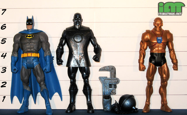
Iron uses the buck body so all the standard joints are present. His “torso sleeve” doesn’t interfere with his waist and still allows for some decent hip movement, but he won’t be sitting down or doing any deep crouches anytime soon. The ab crunch is in there, but it’s completely locked down under the sleeve. The head articulation on Iron is improved as Matty promised for wave 12. It doesn’t have any tilt, but it can look up and slightly down in addition to side-to-side. If you’re keeping score at home that’s 5-1 fixed with Doctor Mid-Nite being the one figure that still has limited neck articulation. Sucks to be him.
On a side note, and without really getting into accuracy in scale, I’d have liked Iron to be built off the larger PE buck just for a little more variation when we finally have a finished Metal Men display. Mattel has the PE buck available and they should be mixing it into the line for characters over 6′ 6″ tall (Iron, Blue Devil, Martian Manhunter…). Right now, it’s just going to waste and giving fans undersized figures.
Mary has no accessories, but does include the largest piece of Darkseid (with his Mother Box). I can’t toss out an accessory she could have come with off the top of my head, but I’m sure in the vast history of the Marvel family there were one or two items that would make great accessories to help increase the value of the figure.
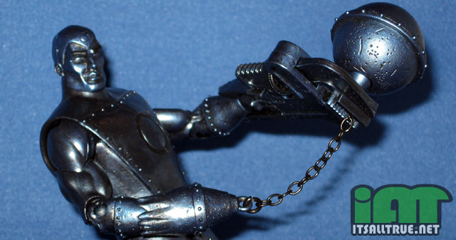
Iron has two attachments that have me looking forward to each and every Metal Men just to see what they’re going to come with. For Iron, he comes with a working wrench and a wrecking ball. Both of these pieces really add some fun to the figure and both fit snugly on his metal hands (though the wrecking ball works better as it encapsulates the hand, the wrench only clips on). I love these pieces and I’m looking forward to the display opportunities they’ll provide when the Metal Men are assembled.
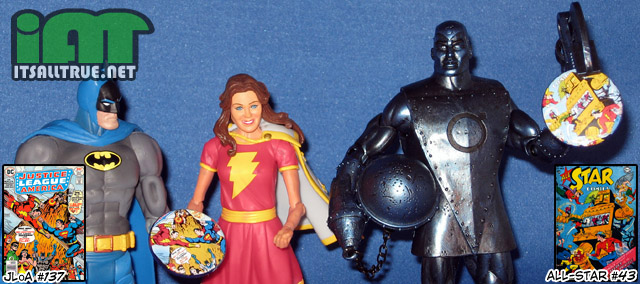
And there’s buttons! Okay, I’ve stated before that I don’t always understand the weird rhyme or reason to the cover choices. Mary’s* featured cover is fairly straight-forward. It’s from Justice League of America #136, which was the first DC cover to feature Mary Marvel outside of then recently resurrected Shazam title. Sharp-eyed readers might notice that Mary is not on the button as she’s been cropped out in favor of the first of many, many, many fights between Captain Marvel and Superman since they shared a universe.
* – Thanks again to Batman for holding the button for yet another two-fisted figure.
Now, Iron, that’s an interesting button. It’s from All-Star Comics #43 which was printed nearly twenty years before Iron existed. Surely, there is no way to possibly connect it back to the Metal Man. Surely. But let me tell you a little bit about that story. In it, the JSA fight a trio of thieves made of gold. They inadvertently follow them back to their planet where everything, even the people, are made of gold. Through torturous exposition, we learn that these golden folk once fought a great war with copper folk using these large menacing golden robots that ran on… wait for it… iron. The entire issue is about iron. See, the gold wanted to use the robots to conquer their world, but there was no iron left on the planet to fuel them, so the gold thieves came to Earth to steal it and ran afoul of the JSA! Needless to say, the JSA takes down the robots, gathers up all the iron, and saves the day. So, essentially All-Star Comics #43 is all about iron. Just not the Metal Man…
I’d be remiss if I didn’t point out that the Metal Men have around 75 comics where they headline on the cover not including tons of guest appearances where they were also featured on the cover. But the JSA fighting for iron… on a golden planet… somehow takes… precedence. I’d love to know who arrived at this cover for this button and how they came to the conclusion.
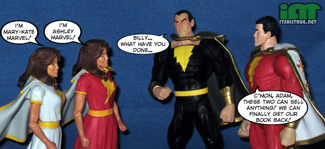
Overall, I gave Mary Marvel points off for awkward proportions, removed articulation, weird palette choices, and I even called her the worst figure in the wave. I did this because she is, but that doesn’t mean she’s the worst figure in the line by a long shot. Most everything is pretty forgivable except the long thigh, that just bugs the hell outta me, but if you can look past that drawback, she’s a decent addition to the line. For my display, I’ll be using the white costume. I always liked that particular change and it will look great when Mattel finally gets around to Captain Marvel, Jr.
Iron is already one of my favorite figures in the line. He’s a great example of a lesser known character being catapulted into fan’s hearts by the 4H’s work. The design does block some of the the articulation, but his sculpted and painted details more than make up for it. The inclusion of the two accessories really help finish the figure and make him the most well-rounded release in DCUC12.
why are her eyes painted as i’m she’s trying to do the undertaker eye roll? that’s weird. and her jaw is too wide for her neck… i’ve noticed in doing custom wrestlers on my video games that a woman’s jaw is CRUCIAL to keeping her from looking like she belongs on rupaul’s drag race. that said, in looking at the hip to knee/hip to head proportion you’re asking about, yes, her thighs are a tad long… but not that much. remember, her hips are below her belt, as they should be, so hip to knee is roughly, from your scale, 2 inches long… from hip to head is 1 & 1/2 inches (i’m measuring to her nose, BTW, the “middle” of her head”. using those same place markers (assuming her “hip” sits roughly as far below her belt as batman’s does on him) bat’s has 2.75 inches from hip to nose and roughly 2 inches from hip to knee. any decent “how to draw comics” book would tell you those proportions are sport on for superheroes, the DC or marvel way… a woman’s legs are longer, proportionately, to accentuate her shape… her legs, per john buscema, are dead on. do YOU want to argue w/ john? 😉
also, don’t beat around the bush… what does “closer to the motuc setup” mean? she has ball hips? then why not just say “she has motuc style ball hips, the best balls on the planet… but mary w/ balls is a problem this figure will face in more than one area.” that’s what you meant, right?
Before I made that statement, I layered that scaled image of Mary against a teenager, an “ideal figure” for life drawing, and a few of the different artists that have drawn Mary when I could find a standing pose to double check it. And on each of those, you have to make a gap in the thigh before you can line up the knees/feet section with the head/torso/waist. There is the option that Mary Marvel just wears her sash exceptionally high. Though a quick peek under the skirt will kill that assertion.
But for you, I went back and ran it against a Buscema woman. She does match up against the few I tried. But, um, he doesn’t draw very well-proportioned women. I’m sure plenty of Marvel fans might disagree with me, but his drawings have shortened torsos and exceptionally long femurs. That is apparently the Marvel way, but as you know Mary Marvel isn’t really a Marvel character. His women do look pretty good in various poses, but I wasn’t a big fan of the standing poses I had to use for the comparison. He’s like anti-Michael Turner. 😉
And closer to the MOTUC setup means exactly that. They’re similar to MOTUC setup, but not the same. It’s hard to be sure with the skirt being so restrictive, but the cuts at the high thigh look to be flat across instead of the cupped sockets on the MOTU thighs.
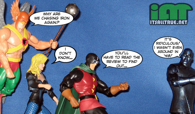
That’s a great story about the comic book. It sounds like they’re messing with us. You can’t unintentionally pick that issue!
Exactly. That tenuous connection has to be done tongue-in-cheek.
Or just a really, really bizarre mistake.
The leg being too long is just carry over fromm Supergirl. She got away with it by smartly baring midriff and resetting our manbrain to not notice. On Mary, the waist is obscured due to the belt.The thing is that they’re not too off, it’s just an extra eighth or so of an inch, but it’s distracting on the shorter figure.
Basically. It’s like the suitcoat on the Question. It’s close enough to fit, but if you look at it too long, you can’t help but notice.
I still will buy her when I find her, but she’s going waaaay in the back. She has wonky women propotions to the extreme.
I think I’d rather have a Black Mary in the long run. That’d be cool.
But Iron is a great figure!
He really is. I can’t wait for Gold!
I have to wonder what she has been doing in that first pic to be so bow-leged. Did she leave her panties at Tawky’s again?
You can thank Mattel for that. I neglected to point out that the awesome plastic used to keep Katma’s legs from bowing was not present on Mary. The white one is fine, but the red one suffers a bit.
Good review. BTW the Metal Men first appeared in Showcase in 1962.
http://www.themetalmen.com/index.htm
Doh! I had it right before. I mentioned Showcase #37 in the first draft and cut it to the year, 62 morphed in 67. I’ll get that set back straight. Thanks!
Mary isn’t the best, but the goofy smile makes things okay by me. Especially when she stands next to Captain Marvel. I just need Freddy Freeman and Dr. Sivana. I love the look of the Metal Men, but it is going to be a long wait to build the full team.
They look good al together. Especially if you tuck Mary back a bit so you can’t see her legs. The face sculpt was something I wasn’t happy about right at first, but it’s grown on me.
I hope they get to Freddy soon and you’re right about the Metal Men. Only two so far? And with a lot of question about Mercury’s and Lead’s constructions, as well as how to handle Tin, and then what of Magnus, Nameless, & Copper… We have a ways to go…
Magnus is a must to have a completed team. I’d at least want Tin, Mercury, Platinum, and Lead to go along with Gold and Iron. Copper would be nice, but not essential.
Magnus is important, but I want Chief for the Doom Patrol more than Magnus. They could be the worst selling 2pk of all-time!
I did not read the entire review. Sorry, Noisy. I just couldn’t because it reminded me of the horribleness that is Mary Marvel! In my opinion, she is the worst DCUC figure I have ever purchased. If it wasn’t because she was the figure packaged with Darkseid’s torso, I would totally have skipped on her. To make things worse, BOTH her legs were warped!
Why does she have a giant head? Why does she have tiny fists? Why are here legs spaced so far apart? Maybe she used to be Mario Marvel…
LOL. That’s okay, just don’t miss the part after the JSA chasing Iron. That’s my favorite part of the review. A little investigation on why that button was included!
Copy that! Very informative, thanks!
Oh, yeah, I forgot to say: Iron is AWESOME! The Metal Men will look really cool all together. Loved the comics, as always!
Kanigher is great. I made a joke once that all my favorite characters from from the 30s/60s/90s, but it’s so true.
So is that a smooth torso on Mary? Could it be re-used for, say, SA teen Wonder Girl? If only to complete the core SA Teen Titans that started with KF-Wally.
Accessory: Mr Mind with a tiny radio?
and you have me totally wanting a 2pk of Freddie (Osiris??) and caped Adam, now.
As for the Metal Men, I’m thinking Tin and (Pla)Tina could be sold together.
Maybe a Magnus and Chief or Rip Hunter 2pk?
SA Wonder Girl… now there is a figure I really, really want. That’d be cool if they could do that. There’s prob a peg under the front of the cape, I’ll have to check.
And great ideas for accessory. It was late and my mind was blanking.
Yes! We’re not alone…