
The one universal flaw on Eldor, at least I’d call it universal, is the hood. I’m sure there’s a company out there that can make a sweet sixth scale removable hood, but Mattel ain’t it. Eldor is light years better than the last time Mattel attempted it, but it still just doesn’t look right. It’s too stiff, sits too high, and I just dislike it. It makes me want to display him without the hood – but that’s just not Eldor! It’s a dilemma. I wish they’d sculpted the hood on like they did with Skeletor & Preternia He-Man. Or made a second head that was more seamless. It’s annoying. More annoying than his belt piece being glued on crooked.

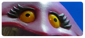
The paintwork on Eldor is almost top notch. The colors look great and the paint really helps flesh the detail out. There is one area that just looks funky here too though – the mouth. I’m not sure how to describe what’s wrong, but I’m going to say it’s that paint is missing. If it extended to the bottom of the sculpted lip line, Eldor wouldn’t look a little like a Planet of the Apes reject. To pad this paragraph, I’ll talk a bit about articulation too. It works. All the usual stuff is there and nothing is blocked moreso than any other figure.
Finally, we get to Eldor’s accessories. They’re both named – the Staff of Elders and The Book of Living Spells. The Staff is from Filmation and while not originally intended to have anything to do with Eldor, it works perfectly. It’s well sculpted, looks great as its own piece and then perfect when given to the figure. It’s awesome, but flimsy. I have a real hard time getting into this left hand, the picture of it warped and bent is how it actually looked after I got it in there.

The decades-awaited accessory is the Book of Living Spells. On the outside, it looks gorgeous! It’s probably one of the best accessories in the entire line. The two symbols, the detail work, and wear & tear really bring it home. It’s sweet! And those folks that couldn’t figure how to engineer Rio Blast? They do know how to make a book open and look great both closed and lay flat. At least there’s that. One downside? The inside is blank. No secrets revealed, not for us. Given the timing, it might’ve been funny for Scott Neitlich’s resignation to be printed in there. That would’ve gotten us all good.

Overall, I do feel conflicted about Eldor. Like Rio Blast, I don’t think his updating went the way some wanted it to, but I’m not as fixated on Eldor as I was on Rio and it’s much, much easier for me to love all the detail and not worry about the alternative. And what detail it is – terrific sculpting all throughout the figure. This guy would fit in any collection that needed a withered, old wizard. The paint and articulation are as good as the line has to offer. And the two accessories are great. Any figure could steal them and look sharp, but Eldor looks so good with him that they’re not likely to get traded away. That hood tho? Ugh. In all, he’s a nice addition. Now when does He-Ro get a love interest??

Recent MOTU Classics Reviews:
 |
 |
 |
 |
 |
 |
For all our MOTU reviews, check out our
MOTU Classics Collector’s Guide.
So you think Eric Treadaway looks like a “withered old wizard?” ;). Dang, that’s harsh!
but it is him. until Eric’s beard may turn white it’ll be some years still but it’s definitely resembling him.
For me this was a must have figure, but I second both the enjoyments and disappointments you have expressed.
Great review, pics, and comics, as always!
I’ve long awaited this figure. Turned out better than I’d hoped, but still not as good as I’d wanted. As you say, the hood is a big part of that. I’ve got plans to redo his entire hoodie in brown velvet, hoping to fix that.
And, yeah, I do kind of wish more of the figures were this detailed. I’m sick to the bloody back teeth of people complaining that their figures are “too detailed.” If I’m paying $30-ish for a toy, I want it to be pretty impressive. The Vintage Only Nazis have been a thorn in my side for a while, now, and a lot of them are also It Has To Be Exactly As I Remember Nazis, too. While I would’ve loved a Book of Living Spells with holographic pages, remember: if it were up to the IHTBEAIR Nazis, Eldor would have come packaged with a random twig taken from outside.
I also like that they made him look a little Nichol-Williamson-as-Merlin-from-Excalibur with the skullcap and all. Anál nathrach, orth’ bháis’s bethad, do chél dénmha!
It always strikes me as a weird complaint too. It’s not even like the difference in level of detail is that extreme – putting Eldor or Rio next to He-Man is like if I were to wear jeans and a plain T-shirt and stand next to a craggy-faced dude with lots of pockets and so, so many buckles. It happens. But people are talking like it’s the difference between a MacFarlane and a minimate…
But then, I just do not understand the aesthetics Eldor. I can understand wanting him in the line, I’m all for him as a character, but in his “vintage” design he’s basically an overly-muscular pensioner wearing tights and a dangerously short bathrobe. It’s odd. The MOTUC update doesn’t resolve this weirdness, and instead adds an extra layer or two; the folded-down hood permanently sculpted onto the back of his terrycloth shortie, for example, which makes it look like he’s actually wearing a hoodie underneath the bathrobe. If it were that chilly in Preternia, you’d think he would go for something a little warmer than skin-tight leggings.
I… think I wandered off the point a bit there.
… plus my book doesn’t lie flat. It kind of looks like there are sculpted stops on the hinges to prevent the back cover opening all the way, so I thought it was deliberate, but perhaps it’s just a moulding error and I need to sand it down a bit?
I got two Eldors (one sub, one day-of-sale) just so I could muck about with attempted improvements and still have one in case I royally foul up.
One of the Eldors has a perfectly functioning book. The other is like yours, Clay. I recommend soaking it in very hot water for a while, then trying to warp it back the way it should be, so that it closes properly and flat. First time I tried just closing it, I scraped some paint off the bloody thing.
“[I]f it were up to the IHTBEAIR Nazis, Eldor would have come packaged with a random twig taken from outside.”
I’ve seen you say this multiple times, but I’ve never seen anyone ask for thiis. I say without sarcasm that I’d love to see a link to any such comment, because yeah, that’s extreme.
Most vintage enthusiasts just want the card back image with Gray turning into He-Ro or the fully realized figure from the ’87 (?) catalog image. I’ve never seen anyone talk about wanting elements from the test shot/prototype image with the twig.
It’s hyperbole for comic effect.
While they have been insistent that the MOTUC versions of previously-unreleased stuff should conform as closely to the prototypes as possible, this comment was thrown out to show how ridiculous that stance really is. Because the Vintage prototypes are exactly that: prototypes — rough, unfinished products that look, quite frankly, BAD. And yet there are those out there who want these $30 figures to be as bland and cheap and undetailed as possible, just like they were 30-odd years ago.
Funk dat.
For the book, it’s a shame they didn’t steal the gag from ‘Circle of Iron’ and stuck some shiny mylar on the pages.
(I think 2 people will get that reference. 🙂 )
That hood… that hood. Man, that’s just sad looking.
I don’t ‘get’ the crowd that complains when a figure has details not present in the vintage toy. Do they complain that He-Man’s bracelet and buckler are painted? I seem to recall plenty of figures that just had the molded color arms and that’s it. Heck, I recall the vintage figs were pretty darn short of paint apps all around.
Style discussions, that I understand. ‘Classics’ look Vs. Filmation look Vs. 2k look Vs. ‘WTF were they thinking’ look, THAT I get and yeah, I can see some jarring visuals on a shelf going on. I think it would have been interesting if they had tried that, different ‘takes’ on key characters, but that wasn’t the mission statement of the line, if my foggy brain recalls. No caramel colored Lava Fighter He-Man with Bola Launcher here!
Say, is that belt pouch and car keys and stuff a parts reuse? Or do we take it all wizards wear their stuff like that? 🙂
funny you mention that, i actually intend something along those longs as a fix to the blank pages… i’m actually glad they left it blank, as for those interested in customizing that book, we get to work on a blank slate, rather than having to repaint or recover something already there that would have been unsatisfactory to my personal tastes anyways
I second being glad that the book is blank, in part because it let’s customizers do what they like and also because I’m desperate to make peace with dayraven. 😉
It might have been nice to include a couple sticker sets in the margins of the very sticker sheet that accompanied subscribers’ Eldor — perhaps something along the lines of the vintage images and another jiving more with the Classics cannon — but what can you do.
Dude, I don’t bare any ill will towards you. One disagreement doesn’t build animosity for me. We’re at peace till we’re not. 🙂
I’ve seen some damn’ cool images where someone used invisible UV ink to paint on the pages, then when they hold it under a blacklight, the pages “glow with magic.” I know there’re a couple of grainy videos on YouTube showing it.
Question? The talks on the books I wonder if Orko’s openned as I never really tried to.
Not a bad looking fig and those whiney wanker that want it their way. GET A GRIP! Gosh thats what kills a fandom if ask me.
A fun review again and great pics. Theres a joke with that limp.staff but I’ll let another do it.
Very diplomatic, Noisy. 😉
I’m happy with the hood, but I assume I received a good sample. Mine fits well (if you accept that it was designed to sit so high on his head) and gives me no trouble.
I set the bar pretty low on this figure and instead was wonderfully blown away by him. My only complaint is that I wish he could hold the book comfortably closed. His hood doesn’t bother me in the least. Could it be better? Maybe but it is certainly not a deal breaker. Other than that I’m glad to add him to my collection.
Definitely rocking the Nicol Williamson as Merlin from Excalibur look. or at least his helmet.
Love that the book opens, too. Great touch.
I’m going to have to track this guy down, later.
Eldor is pretty cool. I only just opened him myself. I’m trying not to let myself get too far behind with openings. As far as his detail goes, I put Eldor in the same category as Fisto and Jitsu when it comes to detail.
Anyone else consider calling him King Miro instead of Eldor (not to imply that they are the same people).
Excellent review. I like the Merlin from Excalibur look. However I think they should have given him a longer flowing robe as it would help his sorcerer look. …and hide those really muscley legs.